TRiptych
|
|
|
VANTAGE POINT
Medium: Acrylic Paint on Canvas
Size: (1x) #30.48 cm x 60.96 cm / (3x) 60.96 cm x 91.44 cm
Completed: March 23rd, 2018
The triptych is to represent my personal conflict of placement in the world, and the mental struggle to find an identity for myself. For this work, I used the cover artwork & poetry of Shel Silverstein's novels 'A Light in the Attic' & 'Where the Sidewalk Ends' as inspiration for the work's imagery & meaning, with aesthetic and visual choices taken from Kathe Kollwitz 'Self Portrait'.
Artistic Inspiration
|
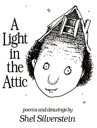
Shel Silverstein (1981) - A Light in the Attic:
Shel Silverstein is an author and personal illustrator for his books. His intended work was not meant for children directly, making his own unique writing and art style that created interest for both kids and adults alike. With the cover for A Light in the Attic, it demonstrates a metaphorical application for "A Thought in the Mind", with the "attic" on the forehead to show the space that makes up your conscious, and the "light" to show your thoughts, or rather, to unveil the thoughts in your "attic". |
|
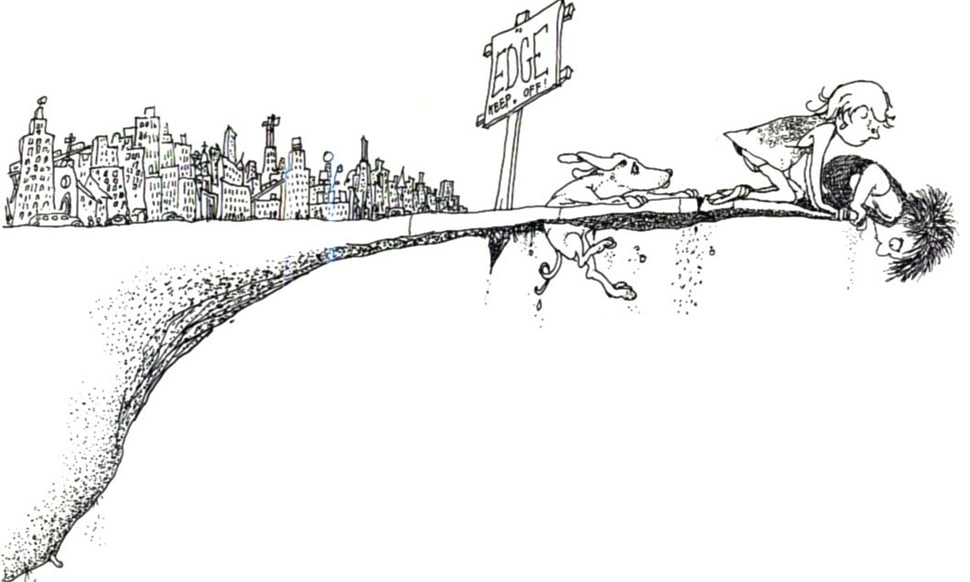
Shel Silverstein (1974) - Where the Sidewalk Ends:
The other inspiration cover of Shel Silverstein's I used was "Where the Sidewalk Ends", which in visual context has a boy and a girl, with a dog at the edge of a cliff - a large city of skyscrapers and factories behind them. Without the poem, it's assumed that the people are trying to find a sort of escape; with the poem it supports this idea, with its message being that we as adults (or those becoming adults) need to look back to our childhood in order to be able to move forward, saying that "the children, they mark, and the children they know the place where the sidewalk ends" (Silverstein 217). It's a metaphorical representation of our desire to live in the past - and the answer that we actually should do that, but use it to move ourselves forward with those "child-like desires", rather than hold us back. |
|
PLANNING, IDEAS, & INTENTIONS
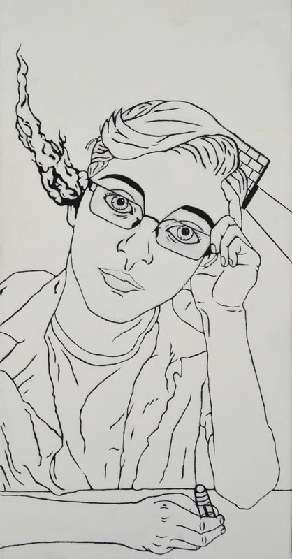
When going through the planning phase of the work, I firstly thought of my representation in Panel One. Initially I was going to do something more lighthearted to contrast from the following panels more serious focus (and from my prior, more serious self-portrait painting) with a warm smirk and my right arm holding my head up, but I considered that it would have distracted from the more hopeful setting Panel Three would establish. Instead, I went for the more distressed and contemplating look, with the emotionless expression, and hand clenching my forehead; the smoke was added to show how overthought and overworked the idea of finding placement has been in my head, and that I'm burnt from it. When incorporating Shel Silverstein, I utilized the cover from "A Light in the Attic" as the interpretation used for the book: the "attic" is your conscious, and the "light" is equivalent to a thought; "A Light in the Attic" can be interpreted as "a thought in your mind". I incorporated the roofing onto the right side of my head (my left) as a visual of my conscious, and included a single window with a light coming out (like Silverstein's) to draw the audience to the second panel's focal point.
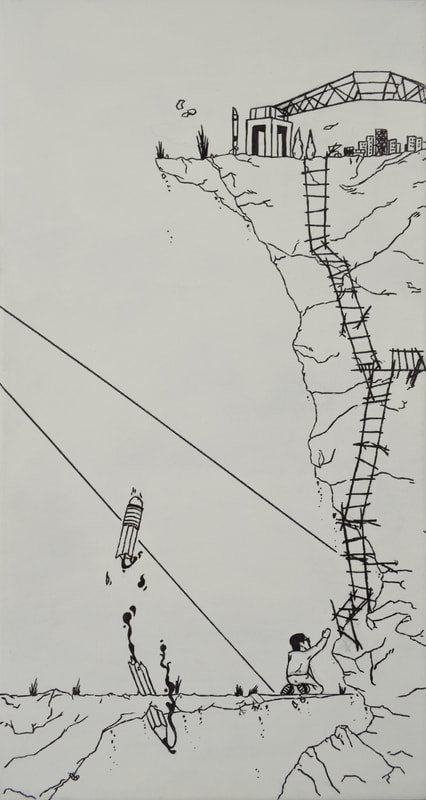
Panel Two is very important. For Panel Two, the light coming from my head onto a visual construction of this struggle is meant to demonstrate how the thought I'm overworked about is being projected from my head from Panel One to Two, as well as shine a light for the audience on this struggle: it's metaphorical for me bringing it to people's attention. What the light's focusing on is me on my knees on the edge of one cliff looking up at another, attempting to reach towards a nearby rickety ladder that leads to an archway and a city on top.
This is meant to be the "City in the Artist" panel for the work; the city and archway on top is how I visualized the world affecting me. The archway on the higher cliff is the same one you pass through on the bridges entering into Milwaukee's Third Ward, an area full of art galleries, art colleges, and artists alike. The skyline of Downtown Milwaukee on the top of the cliff also takes inspiration from SIlverstein's "Where the Sidewalk Ends", taking aesthetic choices from the city's minimally detailed buildings, but moving them from the lower-cliff that I'm on - where they would be - to the top for the purpose they serve in the piece: motivation. The Downtown Area for me has always given me a sense of belonging, and is a main motivation for me to continue wanting to finish my goal of being an "artist in the city". The metaphor is that the Third Ward's arch is a gateway into the Downtown area of Milwaukee, a place where I am motivated and where believe I belong: the top of the cliff is my place in the world, and how the world affects me.
Me at the bottom of the cliff is the other half of Silverstein's "Where the Sidewalk Ends", with me on his knees at the edge of a thin cliff reaching up to a ladder - and a shattered pencil, jabbed through the cliff and leaking ink. In SIlverstein's original book cover, it's a boy, a girl, and a dog on the thin cliff, with a sign breaking through the ground that says "EDGE - keep off!" This image makes more sense in context with the poem "Where The Sidewalk Ends", with its meaning (No, I'm not writing the entire poem) that to adults, or to those becoming adults, we need to revisit our childhood. For me, my childhood was always about telling stories through drawing. In the work, the pencil - placed behind me - is to show this; it's broken, however, to show that I can't "go back" literally to find myself. Instead I have to go forward to do so - with the ladder. Why I'm on the ground is to show the desperation of needing to reach the top of the mountain - to reach for that ladder to get me there, but yet I can't yet.
The entirety of the Second Panel is to show the the encouragement of the city creates a desperation for finding my identity, and shows the struggle I see in getting there.
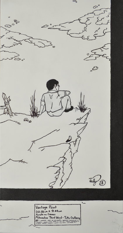
Panel Three switches more to the 'hopeful' setting I mentioned earlier. Panel Three shows how I want to "affect the world": by telling stories through my artwork for people to view. In the case of the work, I want to tell people a story of making it to the top. Panel Three is a painting in a painting - a thick black frame in the sketch with an exhibition text - to show the context that I've made success. In the work, it metaphorically states that I've "made it to the top", with it being the same cliff edge from the prior page; the ladder on the edge of work establishes this. The vast spacing between the objects within the work - and arguable the lines - is to evoke a freeing and "open" emotion. I included my signature "Tully 28" in the bottom of the painting to show that it was my piece, and that I had ownership of the story being told: it's my story.
The color scheme and drawn look for the Tryptic is also due to the aesthetic style of Shel Silverstein, who used an ink-pen for almost all of his work. I wanted to recreate the drawing look of the piece as to keep the piece looking clean and simplified for the audience to process all that's occurring, as well as stay true to my inspiration.
Panel Two is very important. For Panel Two, the light coming from my head onto a visual construction of this struggle is meant to demonstrate how the thought I'm overworked about is being projected from my head from Panel One to Two, as well as shine a light for the audience on this struggle: it's metaphorical for me bringing it to people's attention. What the light's focusing on is me on my knees on the edge of one cliff looking up at another, attempting to reach towards a nearby rickety ladder that leads to an archway and a city on top.
This is meant to be the "City in the Artist" panel for the work; the city and archway on top is how I visualized the world affecting me. The archway on the higher cliff is the same one you pass through on the bridges entering into Milwaukee's Third Ward, an area full of art galleries, art colleges, and artists alike. The skyline of Downtown Milwaukee on the top of the cliff also takes inspiration from SIlverstein's "Where the Sidewalk Ends", taking aesthetic choices from the city's minimally detailed buildings, but moving them from the lower-cliff that I'm on - where they would be - to the top for the purpose they serve in the piece: motivation. The Downtown Area for me has always given me a sense of belonging, and is a main motivation for me to continue wanting to finish my goal of being an "artist in the city". The metaphor is that the Third Ward's arch is a gateway into the Downtown area of Milwaukee, a place where I am motivated and where believe I belong: the top of the cliff is my place in the world, and how the world affects me.
Me at the bottom of the cliff is the other half of Silverstein's "Where the Sidewalk Ends", with me on his knees at the edge of a thin cliff reaching up to a ladder - and a shattered pencil, jabbed through the cliff and leaking ink. In SIlverstein's original book cover, it's a boy, a girl, and a dog on the thin cliff, with a sign breaking through the ground that says "EDGE - keep off!" This image makes more sense in context with the poem "Where The Sidewalk Ends", with its meaning (No, I'm not writing the entire poem) that to adults, or to those becoming adults, we need to revisit our childhood. For me, my childhood was always about telling stories through drawing. In the work, the pencil - placed behind me - is to show this; it's broken, however, to show that I can't "go back" literally to find myself. Instead I have to go forward to do so - with the ladder. Why I'm on the ground is to show the desperation of needing to reach the top of the mountain - to reach for that ladder to get me there, but yet I can't yet.
The entirety of the Second Panel is to show the the encouragement of the city creates a desperation for finding my identity, and shows the struggle I see in getting there.
Panel Three switches more to the 'hopeful' setting I mentioned earlier. Panel Three shows how I want to "affect the world": by telling stories through my artwork for people to view. In the case of the work, I want to tell people a story of making it to the top. Panel Three is a painting in a painting - a thick black frame in the sketch with an exhibition text - to show the context that I've made success. In the work, it metaphorically states that I've "made it to the top", with it being the same cliff edge from the prior page; the ladder on the edge of work establishes this. The vast spacing between the objects within the work - and arguable the lines - is to evoke a freeing and "open" emotion. I included my signature "Tully 28" in the bottom of the painting to show that it was my piece, and that I had ownership of the story being told: it's my story.
The color scheme and drawn look for the Tryptic is also due to the aesthetic style of Shel Silverstein, who used an ink-pen for almost all of his work. I wanted to recreate the drawing look of the piece as to keep the piece looking clean and simplified for the audience to process all that's occurring, as well as stay true to my inspiration.
PROCESS
|
In the process to make my tryptic I firstly built three wooden frames at school for the three canvases, then cut canvas that would wrap around each of the frames, and finally stapled them to the back of the frames and cut off any loose or fringed edges of the canvas. Next, I used a brush to apply two layer of gesso on all three canvases, let them dry, them brought them home to paint.
With all three canvases I re-sketched the design from my planning sketch to my canvases, then prepared my brushes and my black and white paint With the first canvas, the painting process was vastly different than the first two - arguably because of how time-consuming it was. I used my pencil to translate a photo taken by a friend, then set out my brushes and paints to prepare painting. I first applied the black, following along the lines I drew to create the form of myself; this took a long time to do as the lines needed to be thin, and at the time I didn't yet have thinner-tipped brushes. The white was even harder to do with this process, as I was trying to fill in the canvas-space while also avoiding all of the black lines I already drew. While I did finish, I wasted two entire days just to complete one of my three canvases. For me second and third canvases, I had bought thinner-tipped brushes to paint thinner lines, and rather for the painting technique make the entire canvas for both white first, then painted the black lines, and then made touch-ups to clean up areas of the work that were messy. The process went faster for both of the works, and was more fun to work on then Panel One. |
|
EXPERIMENTATION
With experimentation, the largest portion of it in this piece would have to be from the thin-lined painting style. The fine line detailing that Shel Silverstein used to make his works would be easy for his ink-based medium, compared to the painting method I was using to achieve this. During the process, I wasn't fully adjusted to making such long thin lines with the brushes I provided myself, and made larger, blotchier paint streaks that would need cleaning with the white paint. With Panel One, I also didn't paint the background white first before applying the black, making the filling in process extremely time-consuming. After the first one, however, with the following two panels I firstly made sure to paint the canvas white first to avoid the waste of time, and secondly bought a set of finer-tipped brushes that eased the painting process for creating cleaner black lines that resulted in an easier process and a better product.
REFLECTION
Something I took away from this process is that a lot of the work was more meticulous & planned out then some of my other works, & I think that was because of one reason: it's personal. I feel that with the past few works (the sculpture one specifically comes to mind), I haven't been invested into making them because I don't relate as well to the work- it's a clashing of my ideas & the requirements. In contrast this piece was overall easier & surprisingly therapeutic to make, as it's really for myself: with the work's larger theme of conflict of identity & placement- of hoping to find that place of belonging. It's a very important phase of everyone's life, and one that I now have to face. [An interesting thought I had when doing the second panel was "Why can't I reach the ladder? Couldn't I get up and reach it?" While I couldn't fit it into the piece neatly (and the detail isn't necessary for the work's message), it's a thought I may return to for another piece.]
After I had the idea established, the painting process was a different challenge in itself for me, as it was a little more complex from my self-portrait painting. It required more detail and thinner strokes to achieve the look that I was going for, which was in itself was a challenge for me due to my lack of experience - or rather constant practice - with paint; it did result in some struggle with getting the work to where I wanted it, but after a change in my set of brushes to make producing the lines easier, I was able to complete the work. I think a massive change I would make going into another painting project would be to make sure that I have the tools required to make the work faster. A thought I had after the process was done would be to maybe add another color or two to give the work more interest - an example would be grey for shadowing, and red as a guide-line of sorts (as well to give the work a pop); while this may derive from my inspiration, I think the two would aid the piece in both aesthetic and functionality.
After I had the idea established, the painting process was a different challenge in itself for me, as it was a little more complex from my self-portrait painting. It required more detail and thinner strokes to achieve the look that I was going for, which was in itself was a challenge for me due to my lack of experience - or rather constant practice - with paint; it did result in some struggle with getting the work to where I wanted it, but after a change in my set of brushes to make producing the lines easier, I was able to complete the work. I think a massive change I would make going into another painting project would be to make sure that I have the tools required to make the work faster. A thought I had after the process was done would be to maybe add another color or two to give the work more interest - an example would be grey for shadowing, and red as a guide-line of sorts (as well to give the work a pop); while this may derive from my inspiration, I think the two would aid the piece in both aesthetic and functionality.
ACT ResponseS
- Clearly explain how you are able to identify the cause-effect relationships between your inspiration and its affect upon your artwork: The cause-effect relation between my inspirations work to mine was that it was the sketchy - and to contrast refined - art-style that he used to create something that felt playful and messy or structured and clean. I translated more of Silverstein's refined look into the work to fit the drawing style that I'm accustomed to, but also to demonstrate a mature craftsmanship; a lesser-important item in the piece: the broken wooden pencil, was meant to show the sense of moving on and "growing up", and so the art style too reflects that.
- What is the overall approach the author has regarding the topic of your inspiration: My approach to Shel Silverstein's work and how I wanted to use it was as a way of reflection: the entire piece is about me reflecting about my life and place; his work is always about our habits, thought-process, and lifestyle, so to me the idea of reflecting upon things within myself only made using Silverstein's artwork to demonstrate that.
- What kind of generalizations and conclusions have you discovered about people, ideas, cultures, etc. while you researched your inspiration: As I mentioned above (In question 2), Shel Silverstein's works were about breaking down and reflecting individuals habits, thought-process, and lifestyle for both children and adults alike. To me, allowing myself to re-read his books allowed me to reach the conclusion that "reflection is necessary in order to move forward"; while this piece's message is about how the world affects me - and how I desire to affect it in return, it truly is about my reflection to better understand those ideas, and overall who I am now and want to be later.
- What was the central idea of theme around your inspirational research: The theme I was aiming to generally establish was "Identity" (which makes sense for a "City in the Artist, Artist in the City" piece), but when breaking it down it focuses more on the complexity of what makes up that identity and how things aren't so cut-and-dry to comprehend; the second panel I think best represents that idea - along with other ideas of challenge to reach a goal due to a lack of identity, and more.
- What kind of inferences did you make while reading your research: Inferences I made while reading Silverstein's poetry (specifically with the two poems that coincided with the book's covers "A Light in the Attic" and "Where the Sidewalk Ends") is that it focuses on ideas of - again, reflection. In Where the Sidewalk Ends, it is about reflecting on our past to move forward, and in A Light in the Attic it discusses our thoughts and the power they possess for people, as well as their weakness in consuming people.
Citation (MLA)
- Shel Silverstein - A Light in the Attic (IMAGE): “A Light in the Attic.” Shel Silverstein, www.shelsilverstein.com/books/light-attic/.
- Shel Silverstein - Where The Sidewalk Ends (IMAGE): White, Caitlin. “#TBT Reads: The Best of 'Where The Sidewalk Ends'.” Bustle, Bustle, 20 Mar. 2018, www.bustle.com/articles/28245-shel-silversteins-where-the-sidewalk-ends-still-has-lessons-for-us-grownups.
