Norse jack frost - Miad Project
|
|
|
The Isolation of Jack Frost - MIAD Project
Medium: Pencil, Prismacolor Colored Pencils, Ink Pen, Copic 12 Grey-set Markers, Digital Manipulation on Hot-press Paper
Size: Panel 1 - 15.24 x 30.48 cm ; Panel 2 - 25.4 x 33.02 cm ; Panel 3 - 27.94 x 43.18 cm
Completed: July 28th, 2018
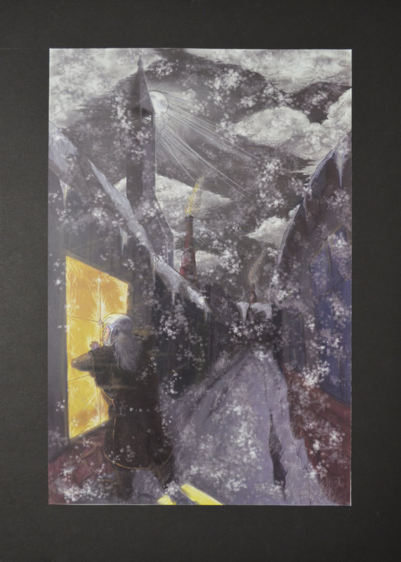
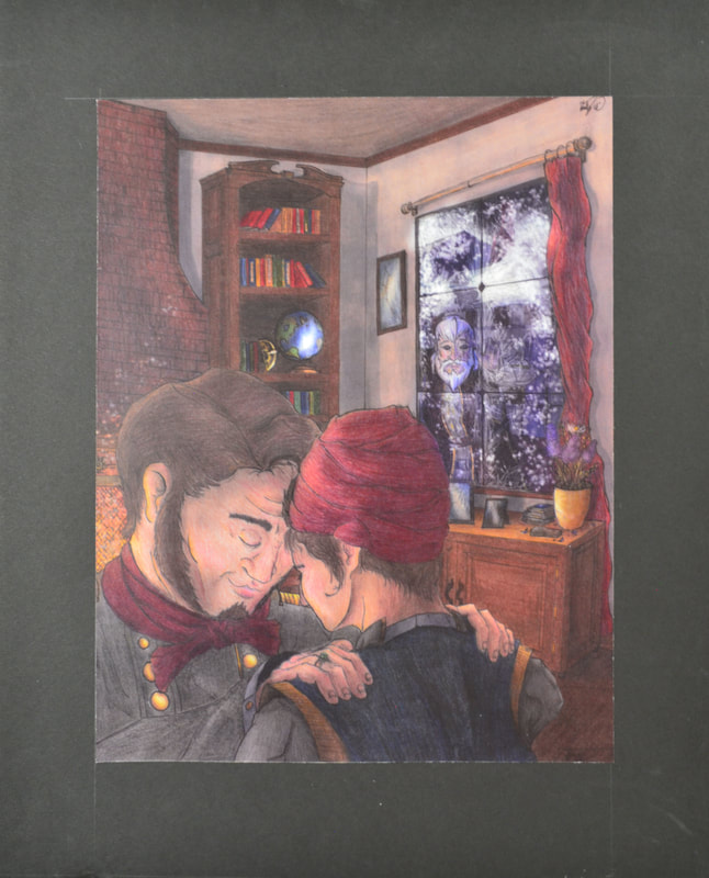
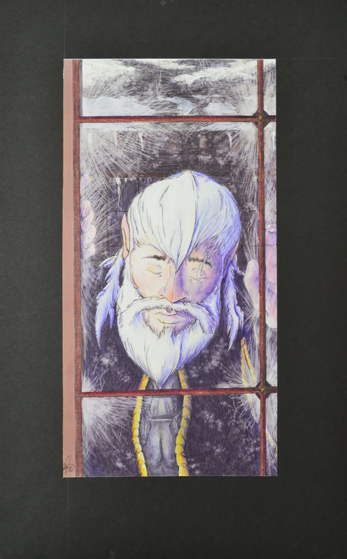
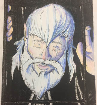
"The Isolation of Jack Frost" is a tryptic made for a storytelling project at MIAD. This piece was to remake a fairy tale character using inspiration from given locations & historical backgrounds. Jack Frost's appearance/story takes from his Norse mythology roots & places him in Iceland during the 1930's, telling a sympathetic tale about his lack of connection with others. I took inspiration from Iceland's architecture and Jack Frost's folklore.
Medium: Pencil, Prismacolor Colored Pencils, Ink Pen, Copic 12 Grey-set Markers, Digital Manipulation on Hot-press Paper
Size: Panel 1 - 15.24 x 30.48 cm ; Panel 2 - 25.4 x 33.02 cm ; Panel 3 - 27.94 x 43.18 cm
Completed: July 28th, 2018
"The Isolation of Jack Frost" is a tryptic made for a storytelling project at MIAD. This piece was to remake a fairy tale character using inspiration from given locations & historical backgrounds. Jack Frost's appearance/story takes from his Norse mythology roots & places him in Iceland during the 1930's, telling a sympathetic tale about his lack of connection with others. I took inspiration from Iceland's architecture and Jack Frost's folklore.
PLanning Works
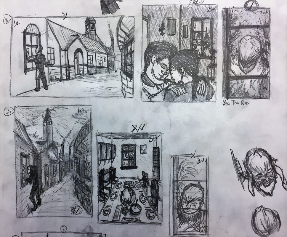
Planning Works:
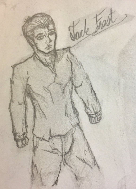
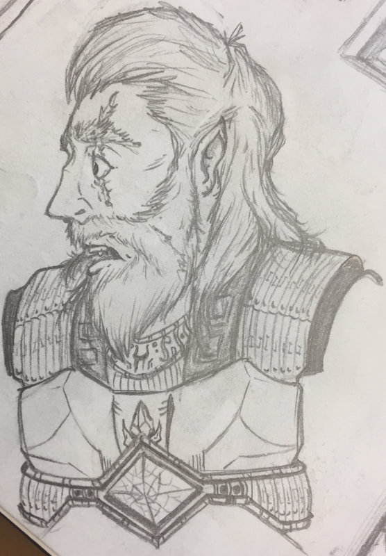
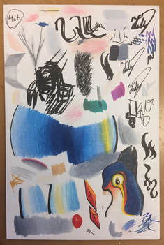
On the left shows a "Rise of the Guardians" inspired look of Jack Frost. The middle panel shows the Norse Jack Frost "Jokul Frosti" that I later used as jack Frost's design. The far-right panel shows the thumbnail sketches to work out the composition of the three panels and their placement next to one another: biggest to smallest, with each panel getting closer to Jack Frost.
On the left shows a "Rise of the Guardians" inspired look of Jack Frost. The middle panel shows the Norse Jack Frost "Jokul Frosti" that I later used as jack Frost's design. The far-right panel shows the thumbnail sketches to work out the composition of the three panels and their placement next to one another: biggest to smallest, with each panel getting closer to Jack Frost.
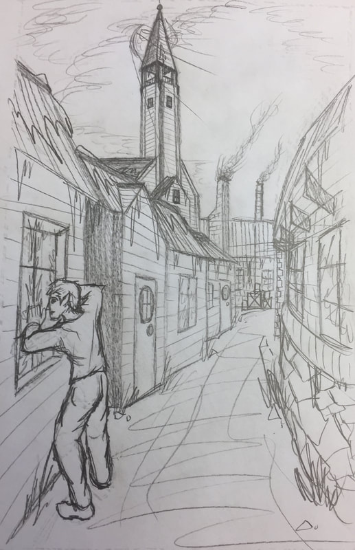
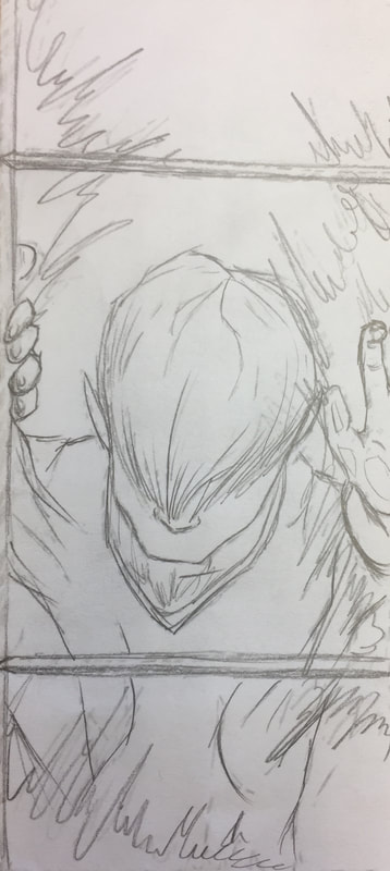
Rough Sketches of Panel 1 - 3:
Using the thumbnails from my planning sketches, I scanned them onto a computer and blew them up to half of their image's final size. After printing them, then I traced the back of the prints onto new paper. Next I went over the faded marks on the paper to refine the composition and detail-work from the thumbnail sketches.
Using the thumbnails from my planning sketches, I scanned them onto a computer and blew them up to half of their image's final size. After printing them, then I traced the back of the prints onto new paper. Next I went over the faded marks on the paper to refine the composition and detail-work from the thumbnail sketches.
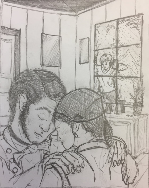
Tight Sketches of Panel 1 - 3:
After group critique discussing each of our rough sketches, I was told that Jack Frost's design in my original intention was lacking personality and depth in the work, and was suggested to make improvements to his design to make him more interesting. I decided to go with the Norse design I made prior, and implemented it into the work. Along with this I further refined the line-work and added shadow to all three works.
After group critique discussing each of our rough sketches, I was told that Jack Frost's design in my original intention was lacking personality and depth in the work, and was suggested to make improvements to his design to make him more interesting. I decided to go with the Norse design I made prior, and implemented it into the work. Along with this I further refined the line-work and added shadow to all three works.
Process, IDeas, & Intentions
|
|
During the making of these pieces, I first scanned & blew up the tight sketches of the works, then printed them to be traced. Using pencil I filled in the back of the prints with lead to allow the traced lines I drew afterward to be translated onto the Hot-Pressed board. Next I refined the lines on the board in pencil, then went over all of the lines with an ink-pen. Next was coloring, which I did using Prismacolor Colored Pencils & Copic Markers. I spent time during the coloring phase of these works doing the most experimentation in getting the colors to blend smoothly & work cohesively with each-other - both in each individual work & across all three side by side. For each of the Panel's I used color palette's to help emphasize a feeling of emotion. Panel One for instance uses colder colors to illustrate the harshness of Jack Frost's loneliness, while Panel Two uses warm colors to show the comfort of being in company with other people; Panel Three uses warm & cool colors to show the conflict of emotion stirring in Jack Frost.
|
After I worked on the coloring I scanned & brought all three works into Adobe Photoshop, where I used custom-made brushes to add in better shadowing & lighting to help with contrast, and added in the snow and frost on the windows to complete the winter look.
Experimentation
|
|
|
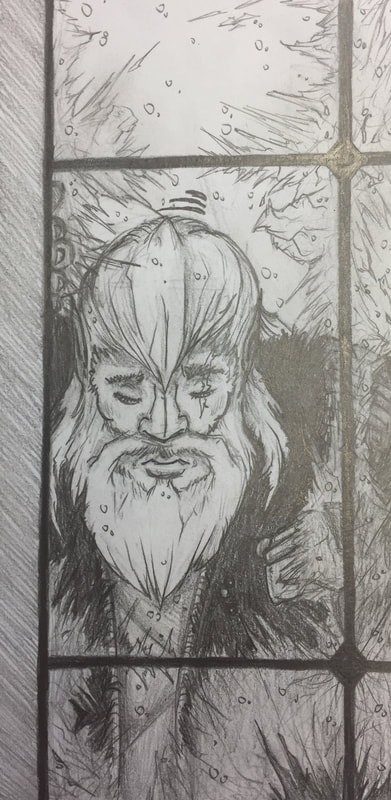
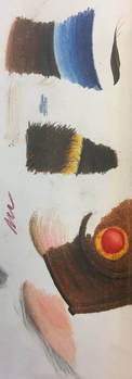
This piece has more experimentation than most pieces, using five mediums - pencil, colored pencil, ink pen, marker, & digital manipulation - rather than just pencil or colored pencil. For this piece, I had first experimented by using these mediums (minus digital) on Hot-press & Cold-press board. I practiced blending gradients, creating highlights, & making texture with the colored pencils, & outlined shapes to help define their edges. When trying out textures for the fur-coat that would be wrapped around Jack Frost, I originally had used different tones of brown that would be layered on top of one another, but it had muddled too far to make out the strokes that'd make out fur. Still wanting to keep what I had, I decided to attempt at using the ink-pen to make individual hairs on top of what I already made - with great success (as seen on the left image). I did the same things on both boards. After spending an hour playing around on the two boards, I went with Hot-press because of its smoother texture - rather than the Cold-press's bumpier texture - that made blending easier & gave the piece a polished finish.
With Jack Frost's design, I had originally done a design similar to the film "Rise of The Guardians" interpretation of him, keeping his clothing simplistic & planning on making his design have an overall blue & white color palette. However, after a small critique of my thumbnails from two of my classmates, they liked the narrative told in the piece you're viewing, but appreciated the detail & personality shown through the Norse version's design. Ultimately I blended the design of Norse Jack Frost into the story, hence creating the piece you're seeing currently.
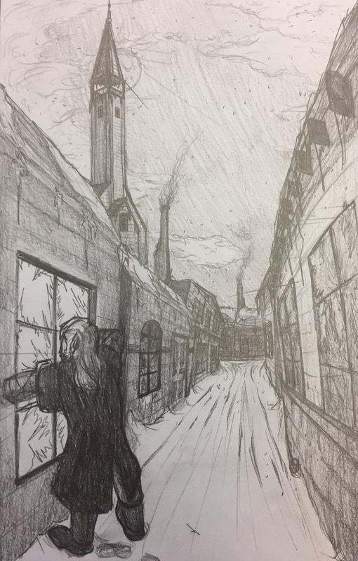
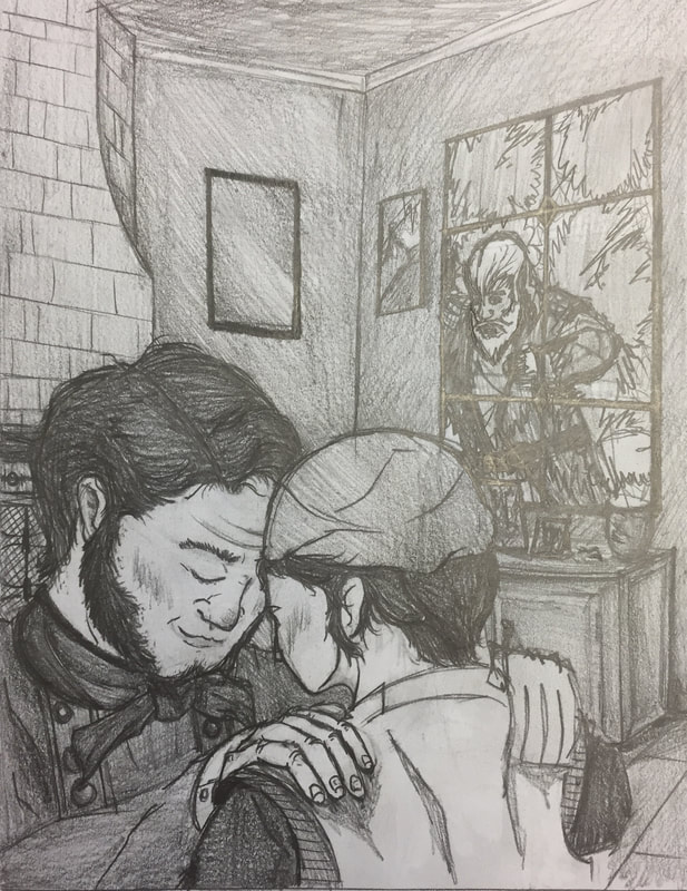
For the actual works, I went through multiple drafts & revisions of each of the three panels. With the first panel, most of the composition stayed the same, although more research was put into looking up streets, windows, & doorways of Iceland during the 1930's to better capture the aesthetic. Panel Two had the most change in its background design from the original, such as including the bookshelf globe, sextant, & photos of constellations to tell the viewer the couple's intelligence & interest with astronomy. Finally, Panel Three had revisions mainly in its composition throughout its development, with the final draft being a hybrid of ideas from the thumbnail, rough, & tight sketches.
With Jack Frost's design, I had originally done a design similar to the film "Rise of The Guardians" interpretation of him, keeping his clothing simplistic & planning on making his design have an overall blue & white color palette. However, after a small critique of my thumbnails from two of my classmates, they liked the narrative told in the piece you're viewing, but appreciated the detail & personality shown through the Norse version's design. Ultimately I blended the design of Norse Jack Frost into the story, hence creating the piece you're seeing currently.
For the actual works, I went through multiple drafts & revisions of each of the three panels. With the first panel, most of the composition stayed the same, although more research was put into looking up streets, windows, & doorways of Iceland during the 1930's to better capture the aesthetic. Panel Two had the most change in its background design from the original, such as including the bookshelf globe, sextant, & photos of constellations to tell the viewer the couple's intelligence & interest with astronomy. Finally, Panel Three had revisions mainly in its composition throughout its development, with the final draft being a hybrid of ideas from the thumbnail, rough, & tight sketches.
Critique
When comparing my original works to the final product, I think that these works turned out better than anything else I've produced before. Mainly for the two weeks of constant focus put on the process phase of the product, allowing for the finalization of the work to be completed efficiently. The details added to the work across its development helped build up the personalities of the character's & the environmental atmosphere. It was enhanced further by the digital manipulation creating better contrast of light & shadow, & allowed for better highlight of the piece's focus on the people. The only change that I'd make to the piece's myself would be to place Jack Frost looking through the window in Panel One on the works right side. Moving Jack would allow the moonlight's glow trail down to meet him more neatly & allow for the three panels altogether to flow more cohesively, with Jack peering through the window on the right making a clean translation to Panel Two, where we see him looking at the couple.
Reflection
Overall, this was one of the more fun pieces I've made - along with it being one of the strongest with its process & thorough research. The process for this work was different and out of my comfort zone from how I have typically done it, yet had a lot of reward in making the final product of this work turning out stronger than even I could've expected from myself. Experimentation with multiple mediums in one tryptic of work was what I took away the most from this project; it broke me out of my comfort zone to make an effort at trying new mediums, & using those mediums with one another to make one large cohesive piece. Color-wise I think that the pieces are very strong as well, especially after the digital manipulation. The only change would be to, again, alter Jack Frost's positioning from the bottom-left on Panel One to the bottom-right to allow for better composition & flow to Panel Two. Otherwise, I'm very proud of these pieces.
Act resposnes
(INCLUDE)
