MIAD ARCHITECTURE
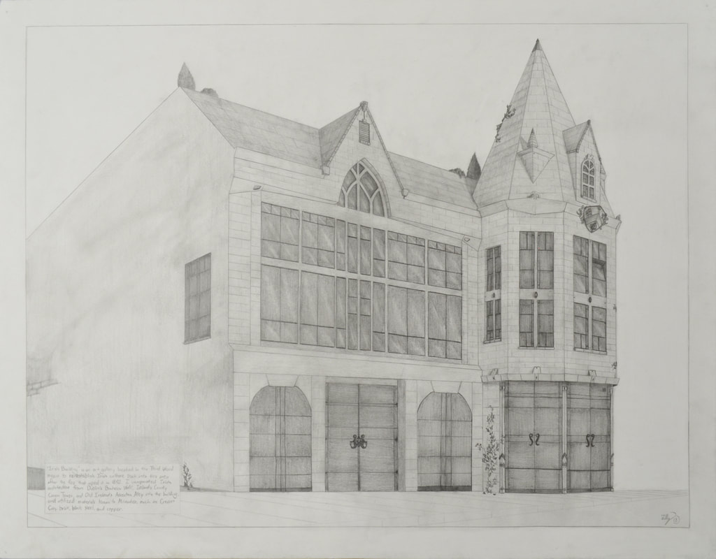
Tully Public Library - Irish Architecture
Medium: Pencil on Paper
Size: 48.3cm X 61cm
Completed: April 6th, 2018
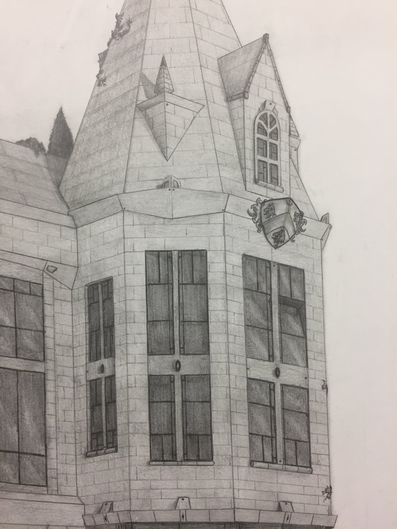
The "Tully Public Library" is an Irish-inspired historical complex located on Broadway in Milwaukee's Historic Third Ward, & is meant to bring Irish influence back into the Third Ward. I used Askeaton Abbey's arched window as a centerpiece above the door, incorporated with elements from St. Peter & Paul's Church for the entryway, and Virginia''s Lurgan Parish church for the tower's roof, then incorporated with Milwaukee's architectural style using cream-city brick & black steel.
Medium: Pencil on Paper
Size: 48.3cm X 61cm
Completed: April 6th, 2018
The "Tully Public Library" is an Irish-inspired historical complex located on Broadway in Milwaukee's Historic Third Ward, & is meant to bring Irish influence back into the Third Ward. I used Askeaton Abbey's arched window as a centerpiece above the door, incorporated with elements from St. Peter & Paul's Church for the entryway, and Virginia''s Lurgan Parish church for the tower's roof, then incorporated with Milwaukee's architectural style using cream-city brick & black steel.
Inspiration
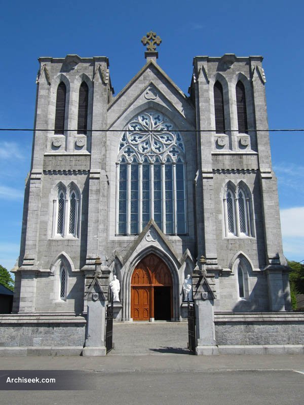
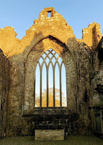
For this work, I choose "St. Peter and Paul's Church" first as an inspiration for the presentation of the entryway. While obvious in the building's design, the doorway and the long window above are both arched; this is widely important to Irish architecture. Many thresholds in Irish architecture are framed with a pointed arch that sinks the door inward to create a sense of transportation from the outside to inside. The arched-window above was (if arched) meant to be used as an "extension" of the door - a signifier of the entrance to the building from a distance, drawing the viewer from afar with it's complex framework from the top to the smaller arch that held the door. The "Askeaton Abbey" was a window located at a ruin within Dublin that I choose with the mindset of it being a replacement of the framework inside of the arched-window above the door, with it being simpler to look at, and later fitting into the simple window design that would go across all the windows.
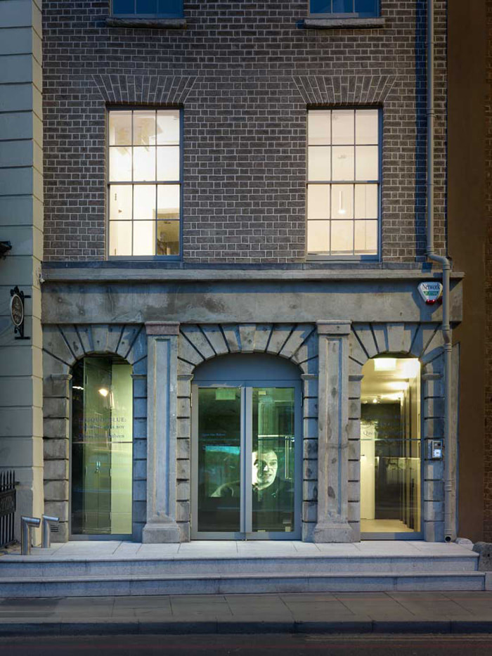
For the windows on the bottom-floor (only on the entrance, not the tower) I decided to go with Dublin's "Irish Architecture Foundation", which has a simple front of two symmetrical windows on either side of a wider, similarly-framed door. I picked this due to its simplicity; I planned on cutting out the doorway in the middle of the two windows with the more arched doorway from the church, just to allow the doorway to better stand out from the rest of the wall. I also used this building as a small reference for the rectangular windows above the doorway for the windows in my piece; other Irish buildings - even going back to ruins in Ireland - all had rectangular-holed windows.
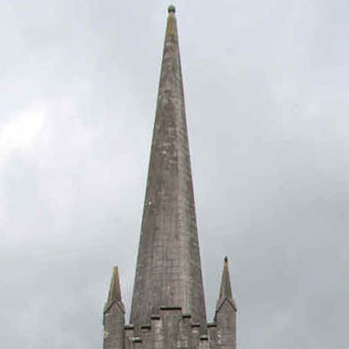
As for the tower, I choose the Lurgan Parish church tower in Virginia, Ireland. I liked the blend of simplicity and complexity with the roof's top, with the smaller spires on the end complimenting and balancing out the scale of the roof. I utilized the roof's design in my piece, and then translated the idea of the windows above for the window's design.
For the windows on the bottom-floor (only on the entrance, not the tower) I decided to go with Dublin's "Irish Architecture Foundation", which has a simple front of two symmetrical windows on either side of a wider, similarly-framed door. I picked this due to its simplicity; I planned on cutting out the doorway in the middle of the two windows with the more arched doorway from the church, just to allow the doorway to better stand out from the rest of the wall. I also used this building as a small reference for the rectangular windows above the doorway for the windows in my piece; other Irish buildings - even going back to ruins in Ireland - all had rectangular-holed windows.
As for the tower, I choose the Lurgan Parish church tower in Virginia, Ireland. I liked the blend of simplicity and complexity with the roof's top, with the smaller spires on the end complimenting and balancing out the scale of the roof. I utilized the roof's design in my piece, and then translated the idea of the windows above for the window's design.
Planning, Ideas, & Intentions
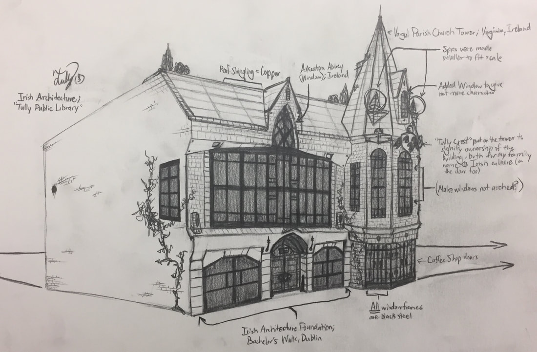
When designing the look of the building, I first had the main idea for the tower, knowing that it would have the roof from the Lurgan Vanish church tower on top, then meshed with the window-design of Irish-architecture. With the design though, I simplified the spires due to the proportions not fitting the downsize of the tower, and then included more geometric framing - made out of the black steel - within a majority of the windows to apply a modern approach to the design. The doorway's that I put on the very bottom of the tower were meant to allow for more light within the building (and later as an inside entrance to an extension of a coffee-shop). During this design process I saw that the roof's surface felt too empty, and decided that a window wuld be placed in the middle as a focal point that made the roof have more character and depth (in perspective).
For the main wall of the building, I used the arched-window from the St. Peter and Paul church with the design of Askeaton Abbey's window framing and placed it in the middle of the wall, then added large-scaled, black-steel windows on either side of the main window to - like the tower's tremendous number of windows - allow for more light within the building. The bottom of this wall was designed with the Irish Architecture Foundation's simplistic aesthetic, with a symmetrical appearance and repetition of the bricks that creates a muted or generalized look that in my building draws your eye to the door.
For the main wall of the building, I used the arched-window from the St. Peter and Paul church with the design of Askeaton Abbey's window framing and placed it in the middle of the wall, then added large-scaled, black-steel windows on either side of the main window to - like the tower's tremendous number of windows - allow for more light within the building. The bottom of this wall was designed with the Irish Architecture Foundation's simplistic aesthetic, with a symmetrical appearance and repetition of the bricks that creates a muted or generalized look that in my building draws your eye to the door.
process
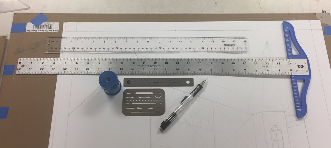
Firstly I gathered the materials needed in order to create the sketch for my building: 2 drawing boards (one for the bristle paper, two to sandwich the paper for transportation - like a portfolio), two bristle sketching papers, three notebook papers, drafting tape, a dusting brush, a T-square ruler, an 18 inch ruler, a 30-60 degree triangle, a STAEDTLER pencil sharpener, an erasing shield, two sketching pencils, and one mechanical pencil.
Next, I taped the bristol paper evenly down onto one of the drawing boards using the drafting tape, and then used the T-square ruler to create a 1 inch frame to help define the actual environment the building would be sitting within. Then with the T-square ruler and a sketching pencil I drew my horizon-line about a third from the bottom of the paper, and then taped one notebook paper on the left of the work and two on the right to continue my horizon-line, and finally added two points on both ends as my vanishing points. Following up with this, I used my T-square ruler on the flat side (the side where the "T-end" is flat with the ruler, and then drew angled lines that would be the basic shape of my building. Followed by many tedious measurements and eye-balling with the T-square ruler, 18 inch ruler, and sketching pen, I had created a slant on the top for the roof, and drew lines that equally spaced out the three floors.
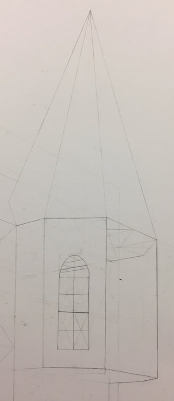
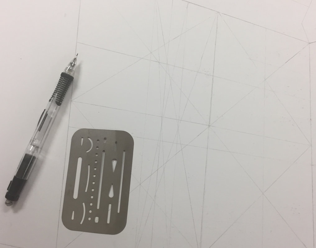
The next step that I took was in making the framing for the tower. On the far right of the building I made an octagon following the perspective, then translated the octagon down to the ground and drew lines to form walls, found the octagon's center and brought a line through and above the column, and finally made lines from the upper-octagon's vertex's to the line's top to form a pointed roof. Afterwards I worked on the wall left of the tower to figure out the equal spacing required for the three columns of windows that followed around the building; this was a large challenge due to their being no easy method provided to create an equally spaced wall of three's. What I did was keep making symmetrical columns until I made 8 evenly spaced columns, then split the third inner column in half, and used that line as the divider lines to make three equally spaced columns.
An issue I ran into though was that I had severely damaged the paper with smear marks and smudges from the grease forming on my hand, and realized that the presentation of the work was compromised. A hasty choice that I made was to restart the project at this point, despite a few dedicated hours of work, and thankfully I had the second paper I grabbed (in case this occurred), and repeated the process again up to this point.
Continuing forward, I tried to be more careful with resting my hand on the paper, and at this point had started to focus on the detail within the work (mainly in the roof and the window's jutting out. I included the arched window from the Askeaton Abbey ruin in the window near the top, added the vent and molding around it, then the shingling. For the tower, I worked on adding spires that - while derived slightly from the initial inspiration's design - fit the smaller scale of the tower and added the needed detail. Following that, I added the small view window on the tower's roof, and then touched the whole roof with shingling that lined up with the building's main roof. Following this, I shaded in the roof's shingling and mold-work, and then colored in the windows with a darker tint to contrast the roof.
Continuing forward, I tried to be more careful with resting my hand on the paper, and at this point had started to focus on the detail within the work (mainly in the roof and the window's jutting out. I included the arched window from the Askeaton Abbey ruin in the window near the top, added the vent and molding around it, then the shingling. For the tower, I worked on adding spires that - while derived slightly from the initial inspiration's design - fit the smaller scale of the tower and added the needed detail. Following that, I added the small view window on the tower's roof, and then touched the whole roof with shingling that lined up with the building's main roof. Following this, I shaded in the roof's shingling and mold-work, and then colored in the windows with a darker tint to contrast the roof.
Following this, it was a rinse-and-repeat- process of just creating lines using the vanishing points to make the bricks and windows. From here after, it was all coloring and shading, adding specks into the brick as holes or imperfections in the bricks surface, and attempting to contrast the walls by creating a light source that came from the front. While it was a small challenge - both in the shadowing and shading - once completed the project overall had a quality that I (for the time being) was satisfied with.
experimentation
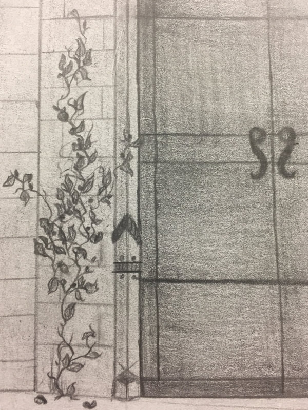
As briefly discussed in the process, one of the struggles I had was creating enough contrast with color in the work, using only a grey-scale. This did cause some struggle in trying to keep consistent color across a large or small surface - for the windows, the bricks, the window's metallic frames, the door handles, and the shading. It was all very challenging to do, but the largest challenge was (ironically) the large blank wall on the building's left. I couldn't put anything on the ground level due to a parking lot being in the way adjacent to that wall, which left me puzzled as to what I should put on it, I added some small brickwork in places and a window to fill in the space, but the wall was left mostly open (This changed later during revisions I made).
On a more broad level though, the entire process was an experimentation. Learning and experimenting how to make octagons, curved/arched windows, and complex shapes in persepctive to make the tower, the windows, and all of the brickwork, was a long process that was frustrating to accomplish at times, but well worth the work for the appeal of the building.
On a more broad level though, the entire process was an experimentation. Learning and experimenting how to make octagons, curved/arched windows, and complex shapes in persepctive to make the tower, the windows, and all of the brickwork, was a long process that was frustrating to accomplish at times, but well worth the work for the appeal of the building.
Critique
When comparing my planning sketch to the finished product, I've accessed that the final work has less of what I intended to be in the work. The main building and most of its components are what I intended to include in the design of the building, but what is missing from the piece is the setting for the building to be placed into; it's missing the tables and chairs, the bike-rack, signs, surrounding buildings that encompass the sites location on Broadway, and most crucially people. While not in the planning sketch (and more so an afterthought and reflection) I'd like to include some view of the interior, like the front desk and bookshelves, along with some people scanning those shelves inside. It would really bring the piece to life and set that the building is a place for "gathering" of people, whether finding books or meeting people for a drink and meal at the café.
reflection
Before the MIAD critique, something that I reflected upon the work was a few key focuses. Firstly: more detail. For a more close-up shot of the building, something that I later became unsatisfied with was the lack of "character" the building had. Yes, the building had Irish architecture and detail, and it looked complete, but it was lacking the surroundings objects that placed it into a proper setting and made the building feel settled in; examples of what I mean is vegetation, signs, cars, and more surrounding the building, skyscrapers that were encompassed around the building's location on Broadway, and people to really give the building's scale. As a side-note, I also didn't get to include the "Tully Crest" into the building, which for me lost a personal value that I wanted to give the building: recognition of Irish culture and my family.
Something that both Matt (my critique) and myself agreed on was the definition of lines that were lost in the shading of the building. It was an easy fix, but a necessary one that would help define the building better within the space and give context as to where things overlapped - started and ended, etc. Also he did comment on the windows needing some more detail that could help the building sit more within realism.
Update: After the critique (and currently), I've redefined all of the lines within the work, and I must agree that it's aided in making the build stand out way more. It helps show where lines start and end better, and makes the building look more grounded in the work, not so faded into it. I've also been adding more detailing and layering - mainly molding and etching - that I may have missed in my initial presentation to help give the building more of that "character" I am looking to be in it. I also included the Tully Crest (my family crest) on both the door and on the front of the tower to serve for two things; one: the one on the tower as a statement of Irish culture and partial ownership/recognition of the "Tully" name (hence "Tully Public Library"), and two: the one on the door as symbolism for the Tully family welcoming you to the library. So far, the changes have drastically improved the quality of the piece, and I plan on continuing to update the work further and make it a standout piece in my portfolio.
ACT ResponseS
- Clearly explain how you are able to identify the cause-effect relationships between your inspiration and its affect upon your artwork: I was able to identify the cause-effect relationship of my piece to my inspirations through the translation of Irish architecture into my library. This can be seen mainly in the building's main entrance, the feature window above the door, and the overall design of the tower.
- What is the overall approach the author has regarding the topic of your inspiration: Regarding my topic of inspiration, I choose Irish architecture because of personal ties the culture has to my family name "Tully" and my name specifically "Shalen Tully" - both of which are Irish. Also, with me wanting the building's location to be in the Historic Third Ward, I viewed using Irish architecture as a way to reintroduce the Irish influence that was lost in Milwaukee (especially after the 1892 fire that destroyed most of the Irish immigrants buildings); it was important to have this building acknowledge the Third Ward's past, and the Irish immigrants that once literally built it.
- What kind of generalizations and conclusions have you discovered about people, ideas, cultures, etc. while you researched your inspiration: What I discovered through research of older-styled Irish architecture was more so the importance that Irish architecture had in influencing Milwaukee architecture - as in many ways it today is still shows in buildings like City Hall, yet how it's not acknowledged (unless you count The Irish Pub). The people in Ireland acknowledged their past - they live and breath in it - but in Milwaukee it's just viewed as another building; this only reinforced the importance of making my building heavily Irish inspired.
- What was the central idea of theme around your inspirational research: The theme I was aiming to establish was "Identity", and more specifically recognizing the people of your past that led up to who and where you are today, and giving them acknowledgement; an important example of this is the Tully Crest - my family name's crest - that I put to on the building twice to demonstrate my family ties/history from Ireland and their importance in bringing me here. I made the building a library specifically (after my critique) because it made the most sense with looking at stories within books that tell the history you belong to, and how that makes up who you are.
- What kind of inferences did you make while reading your research: Inferences that I made during my research was that the more "ancient" Irish architecture was very either simplistic and bulky due to the fortified build that the Irish used during their time of monarchy, or very complex and slight in its design to better represent (for its time period) the upper-class religious royalty in Ireland.
Citations (MLA)
“Byers Families in Church Records.” Byers Families in Church Records, www.byersfamilies.com/church-records.php.
http://archiseek.com/2013/st-peters-paul-church-monasterevin-co-kildare/
http://www.patrickcomerford.com/2017/01/strolling-through-beautiful-cloisters.html
http://mcculloughmulvin.com/city-arts/2016/6/30/city-arts-bachelors-walk-dublin-1
http://archiseek.com/2013/st-peters-paul-church-monasterevin-co-kildare/
http://www.patrickcomerford.com/2017/01/strolling-through-beautiful-cloisters.html
http://mcculloughmulvin.com/city-arts/2016/6/30/city-arts-bachelors-walk-dublin-1
