LEgacy illustration 1
I Did The Best I Could - "Legacy" Illustration
Medium: Pencil and Prismacolor Colored Pencils on Paper
Size: 48.3cm X 61cm
Completed: July 7th, 2018
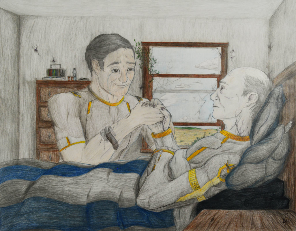
"I Did The Best I Could" focuses on human suffering & guilt, shown through an intimate moment between William & Ryan Legacy - father & son - as the son can only hold onto his his father's hand & watch as he inevitably pass away from an incurable virus. This work uses the theme of human suffering from the aftermath of conflict from Kathe Kollwitz "The Parents" (1923) & takes visual inspiration from Norman Rockwell's "Saying Grace" (1951).
Medium: Pencil and Prismacolor Colored Pencils on Paper
Size: 48.3cm X 61cm
Completed: July 7th, 2018
"I Did The Best I Could" focuses on human suffering & guilt, shown through an intimate moment between William & Ryan Legacy - father & son - as the son can only hold onto his his father's hand & watch as he inevitably pass away from an incurable virus. This work uses the theme of human suffering from the aftermath of conflict from Kathe Kollwitz "The Parents" (1923) & takes visual inspiration from Norman Rockwell's "Saying Grace" (1951).
Inspiration
Planning Works
|
|
Loss & suffering were the two driving themes of this particular work - with the focus being Ryan's struggle to accept his father's inevitable death, while still trying to comfort him in his last moments. The title for this piece was already solidified for me during this phase: "I Did The Best I Could"; it is spoken by Ryan (on the left) to show his guilt and failure to not be able to save his father's life.
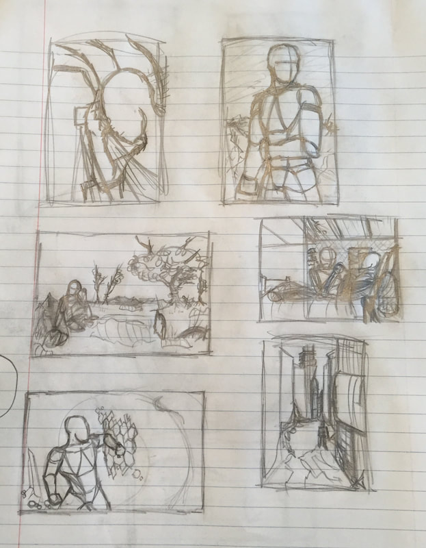
The left image is of thumbnail sketches I did of multiple ideas I had to create a flesh-out a full narrative of these characters. The thumbnail in the middle row on the right is the first piece chronologically in the story, starting in a bedroom with the father's demise meant as a catalyst for Ryan's journey. With this being the first "scene" in the story, I decided that this would be the first work I would produce of it. With the thumbnail I was aiming to make the viewer understand that the scene captured was personal and emotional. With the thumbnail the position of the two characters are closer together to show the intimacy and importance of the relationship being lost - mainly for Ryan. Them holding hands demonstrated the strong relationship these two have, and further pushes what Ryan is losing: his father.
The left image is of thumbnail sketches I did of multiple ideas I had to create a flesh-out a full narrative of these characters. The thumbnail in the middle row on the right is the first piece chronologically in the story, starting in a bedroom with the father's demise meant as a catalyst for Ryan's journey. With this being the first "scene" in the story, I decided that this would be the first work I would produce of it. With the thumbnail I was aiming to make the viewer understand that the scene captured was personal and emotional. With the thumbnail the position of the two characters are closer together to show the intimacy and importance of the relationship being lost - mainly for Ryan. Them holding hands demonstrated the strong relationship these two have, and further pushes what Ryan is losing: his father.
Process, IDEAS, & INTentions
|
|
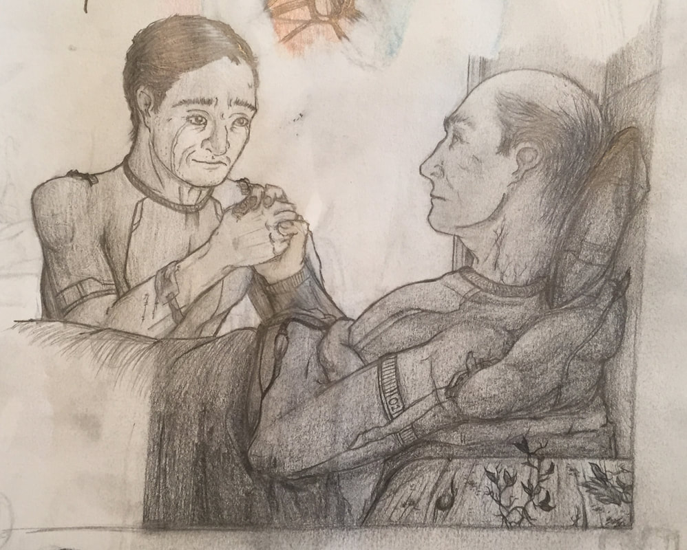
With the completion of my Tight Sketch, the next thing was to make the final draft of the work. Due to not having any tools to project the sketch onto the paper, I had to recreate the work from only observation. When figuring out the positions of the figures within the space, I loosely observed the Tight Sketch & made oval & circles that would frame where the characters would be within the space of the work. I put a focus on the father - William Legacy - first, starting down at his arm to define the works center point, then built up the father's torso in proportion to how it was done on the Tight Sketch. After I worked on his face & neck, adding in more detail-work to his veins, skin, & eyes to exaggerate his death. Afterwards I worked on an even rougher format as to where the hands and his son would be positioned. Afterwards I moved onto the torso of the figure on the left, using the sketch to help define out their torso's & arms. Following this I spent a lot of time & revision on the sons face to help display his emotions, angling the head more towards the viewer & over the bed to look more directly at his father. As for the background, I added basic furniture to help make the space feel lived in; the window was important though in showing the work's center, & creating a focus on where the viewer's attention should be.
|
After this was coloring. I always knew that I wanted the piece to have an overall gray tone to it, with the gold & blue colors being used to emphasize the figures of focus: the father and the son -along with the window to help find the picture's center. With the father I choose to keep him grey in comparison to his son's normal skin-tone to show his death, along with his veins & eyes having a purple tone to further emphasize the oddities of his virus.
Experimentation
With the work's larger size, I experimented with creating balance & unity of the work through its composition, detail & line weight, & color.
The original composition of the work was actually going to be in a portrait. The lower-half of the work would've been the same scene of the father & son - enveloped in darkness, in the bottom-right corner. The upper-half would've been the house's broken roof with a beam of light cracking through it, which would follow the piece downward onto the tow characters. It would have given the piece complex in its tone: empty & somber, yet hopeful & ethereal. I decided against this idea when I wanted to challenge myself & push towards a more realistic piece, assimilate to Norman Rockwell's work; as well I made the father & son bigger to put focus on the intimacy of the moment between the two. The placement of the window in this iteration was important as it gave the piece a "center" that kept the light on both of the characters in this dark setting.
The detail and line-work in the piece is interesting, as I think that in my experimentation I both exceeded the original detail in my Tight Sketch, but also let some areas falter in what I do best: environmental storytelling. When I worked on the detail for the piece, due to its larger scale I was able to really get in small details into the characters faces & body that helped aid in differing them from each-other. However, this process was very time-consuming, & due to poor time-management, led to me having to rush detail in for the environment surrounding the characters, affecting the neatness the piece had. The line weight in this piece was to have the two figures & the window use heavier line while the rest of the background used thinner line, but due to me rushing on the background its line became muddled & loose, making the piece lose its cohesion.
The color in this piece was the most experimental, but ultimately did not create the results I intended. During the process I knew that the piece was going to overall use yellow, blue, green, brown, tan, & gray, but I didn't yet know where I wanted to utilize the colors within the work. For sure I knew that the characters were going to wear grey & gold outfits & that the skin-tones would be tan/pale & gray, so that is what I started & completed first. The window also turned out well, with the blue aiding in framing in the characters. With the rest of the piece though I needed to experiment more with the color, but my mistake was doing it on the final work. The result led to a piece that in some regard doesn't have great cohesion, as the colors in some areas feel very spastic in their placement. The colored pencils also blurred the pencil lines a bit, muddling the piece & breaking the cohesion further.
Critique
With this piece, I think that I succeeded in executing the composition of the work to the best of my ability, capturing the emotion connection between the father & the son. As for the figures in the work, I think that their overall proportions were done well due to the time spent on making sure these proportions were as accurate to the male human model as could be - using reference from photos & myself. The emotion of the characters was captured well in line-work, but one criticism to capturing the somber atmosphere tone in the piece faltered when it came to color. The colors of this piece turned out more muted than I intended with the use of various grays, making the tone of sadness through color not conveyed or lost. The coloring also lacked depth due to my lack of contrast with the overuse of grays, making the piece visually look flat in some areas - in turn somewhat hurting the composition.
Reflection
This piece is the first in many attempting to try & create a narrative - & in turn its visual style. While this piece sets up the story's core themes of loss & the struggle of "moving on" through its composition, I think that the execution is poor due to a lack of a developed environment & substandard usage of color. The color of the work could be adjusted digitally in Adobe Photoshop, however, which would aid in correcting the poor color presented in the piece. In order to improve the background though, that may require me to make an entirely new background & edit it with the old characters, or remake the piece entirely - traditionally or digitally. I still can give myself credit to the composition of the work though, which I think turned out good thanks to photo references I used of my family. In the future, though, if I were to remake this piece I'd likely try the original portrait composition & experiment with contrast more within that work. For the work I have currently though I think it's good, but has areas of improvement that'll be noted for future works.
ACT Responses
- Clearly explain how you are able to identify the cause-effect relationships between your inspiration and its affect upon your artwork: Norman Rockwell's work influenced the visual of the piece in making it aimed more towards realism, and blended it alongside my usage of line work. Kathe Kollwitz influenced the themes of this specific piece to be aimed more towards human suffering & general sadness.
- What is the overall approach the author has regarding the topic of your inspiration: Kathe Kollwitz work visually addresses the aftermath & consequences of the actions of war: the loss of human life & human suffering. I took the ideas present in her work, & decided to show the buildup towards those consequences, showing ones path to death & the suffering it inflicts on others.
- What kind of generalizations and conclusions have you discovered about people, ideas, cultures, etc. while you researched your inspiration: What I've learned from Kathe Kollwitz and Norman Rockwell's work is the different viewpoints on war, actually. Unrelated to the themes of my work, Kathe Kollwitz work shows the civilian casualty & suffering of WWI, while in juxtaposition Norman Rockwell shows the patriotism of the U.S. during & after WWII.
- What was the central idea of theme around your inspirational research: The themes presented in Kathe Kollwitz work focus on human suffering & the consequences of war. She exaggerates proportions & uses line to show malnutrition and are expressing some sort of pain - whether through exaggerated crying expressions or empty, hollow expressions.
- What kind of inferences did you make while reading your research: Inferences I made while working on this piece is capturing emotion. Kathe Kollwitz work WWI work consists of capturing the civilian side of the war & allowing you to empathize, & she did this best by exaggerating people's faces.
Citations (MLA)
Kollwitz, Käthe. “Käthe Kollwitz The Parents (Die Eltern) (Plate 3) from War (Krieg) (1921-22, Published 1923).” Willem De Kooning. Woman I. 1950–52 | MoMA, Heather Hess, 2011, www.moma.org/collection/works/69684.
