DIGITAL COLLAGE
Disassociation
Medium: Lens-based Photography & Digital Painting
Size: 60.96cm X 91.44cm
Completed: April 20th, 2018
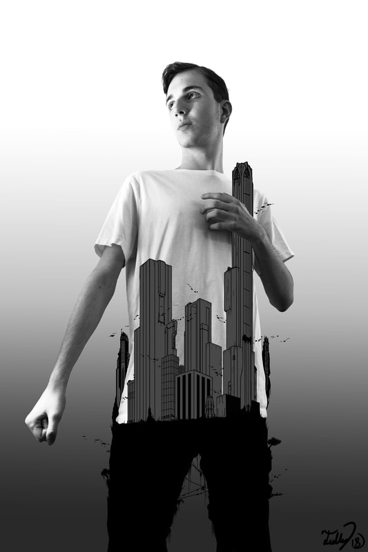
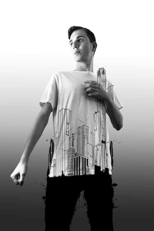
Disassociation is a work that displays how my fictional worlds interact with the literal world, & how they're intertwined in making myself whole. The upper-half of my body is me, the one who creates these fictional worlds, & the city is the creative drive I use to push myself forward. These two worlds meet at the chest, above my heart. I used John Wilde's "Wisconsin Wildeworld" as a foundation for the work's ideas, & Hugh Ferriss's modern-architecture sketches for architectural inspiration.
Medium: Lens-based Photography & Digital Painting
Size: 60.96cm X 91.44cm
Completed: April 20th, 2018
Disassociation is a work that displays how my fictional worlds interact with the literal world, & how they're intertwined in making myself whole. The upper-half of my body is me, the one who creates these fictional worlds, & the city is the creative drive I use to push myself forward. These two worlds meet at the chest, above my heart. I used John Wilde's "Wisconsin Wildeworld" as a foundation for the work's ideas, & Hugh Ferriss's modern-architecture sketches for architectural inspiration.
INSPIRATION
John Wilde - Wisconsin Wildeworld
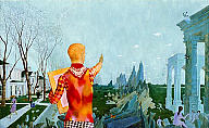
John Wilde was an influential artist and member who partook the Wisconsin Surrealist Movement, and was well-known for rejecting even the Surrealist idea of the "American scene" and creating a style referred by the MOMA in New York as "magic realism", of which is justified by his works. Specifically, in Wisconsin Wildeworld. Wilde has always displayed his imagination in his works, and Wisconsin Wildeworld is John Wilde's way of expressing his understanding of it.
The composition of the piece is much more important than in most usual works, because it discerns where Wilde in the work stands. Literally. In the work, Wilde is standing in the middle of a road in an urban neighborhood of Milwaukee, and is the connective tissue that stands between the real world and the surreal; yet, in opposition to this he also highlights himself in warm colors to contrast from the work's cooler color-palette, and allows us to interpret that he stand outs - or rather doesn't fit - into either world he's in. However, Wilde is positioned himself on the rock-wall that leads into the fantasy world to show how while he stands in the middle of the road in the real-world, he's truly engulfed in the fantasy world. Him looking and pointing his pencil in that direction also solidifies that he is more directed towards his fantasy worlds.
|
Hugh Ferriss
Hugh Ferriss is an American artist and architect that designed futuristic-like buildings that explored the idea of modern urban life. Many of his buildings used geometric (cubic and triangular) shapes to create buildings that served for the foundation of modern architecture today. His works were usually in monochrome, due to him making his works out of pencil or using photography. His "zoning law series", containing a plethora of architectural works, were what I picked from. It shows buildings of varying scale, height, depth, and detail that made each one stand out. In his works, he used the contrast of black to white to define the points of interest. |
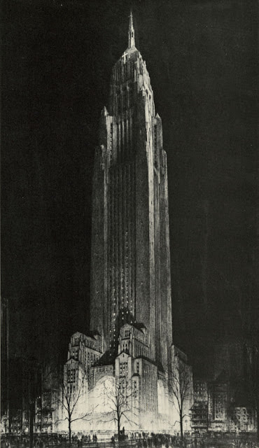
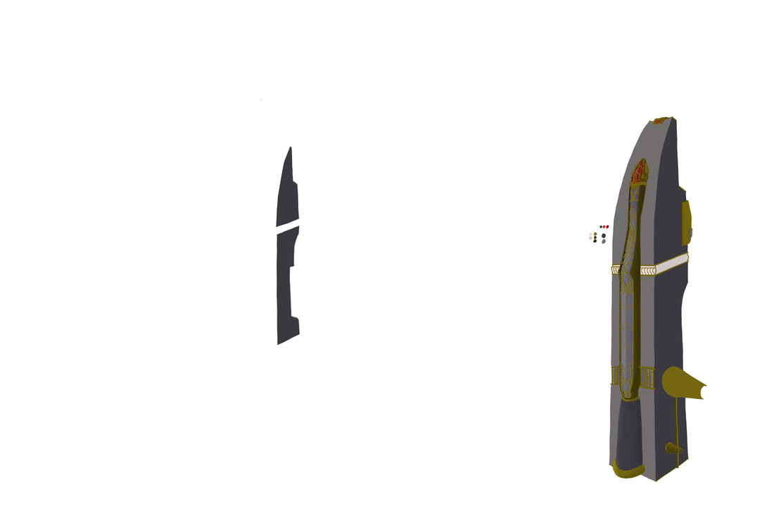
Hugh Ferriss - Convocation Tower - 1924
|
Planning, Ideas, & intentions
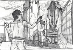
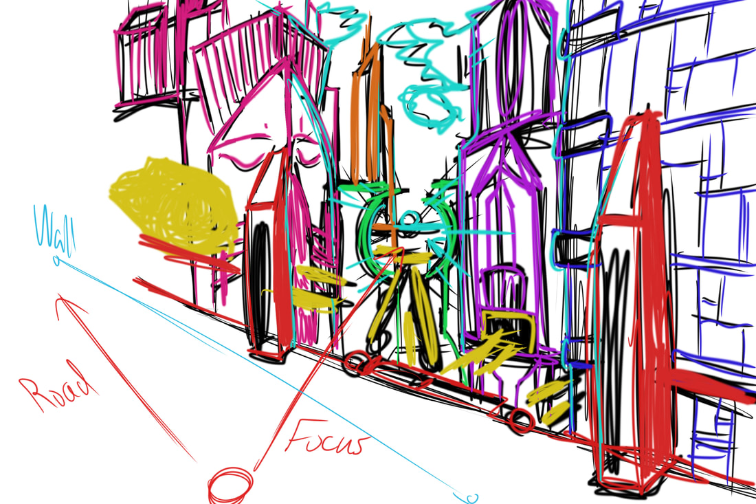
During my planning process I actually had a different idea for how I wanted the work to be presented. It was much closer to the original layout of John Wilde's piece, but being more direct in the divide between the two, with a reflective, but transparent wall being in between the two worlds I'd have; the real world would be a photograph on a street in Milwaukee's Third Ward, and the imaginary side of the piece - being two-thirds of the work like Wilde's - utilized Hugh Ferriss's architecture to display my imagination: a futuristic world. The use of monochromatic colors would help give the piece the surreal / fictional idea in contrast to the chromatic image of myself in the work. It's main idea was to show how the imaginary world was an escape I used from the real-world; my newer idea though gives better justification for why I create these worlds: because I need to.
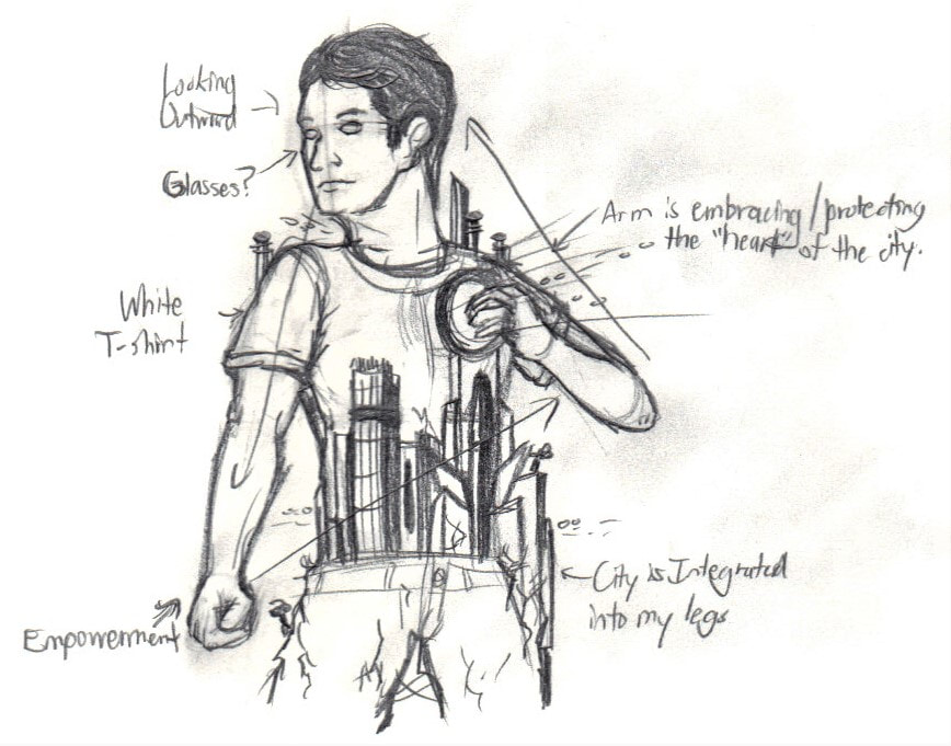
My new idea focused on how I create my imaginary worlds as a foundation to keep myself motivated. While still using the city as "escape", it gives the piece - for me at least - better justification for my reasoning. The idea for my tryptic (the piece prior to this one) was an in-depth look at my thought-process, and how it feels that I've lost my identity, and am in search of one through Milwaukee's Third Ward. This piece is almost identical to this idea, but reworks it into showing how much "the city" of Milwaukee as a collective has affected me, and given me a drive that i otherwise think I wouldn't have. The integration of the city continuing down my pant-legs is to show the integration the city has with me, and that it keeps me motivated to move forward. The foundation of my city is my legs, the foundation I use to literally walk forward. The city is metaphorical for my art too, and that without me creating things (like these fictional places), I wouldn't have guidance and motivation.
Process
Starting the process, I worked on taking the photograph of the piece's focus: myself. The original intent for the work was to have myself from a backside view reaching my arm out to a transparent wall that would be made in digital painting / editing. I told my mother the vision I had - and positioned myself in front of a lamp for the correct lighting I needed, and then she was the one that took the photos for me. We took about 4-5 photos in this positioning, then choose one of the four that had better composition (it had better perspective and contrast from the light).
I brought the image to my computer, and then decided to work on a rough-draft of the buildings and their layout in Photoshop (using a reference from my planning sketch); I felt that in comparison of my planning sketch to Hugh Ferriss's work, I took note that the architecture in my planning were more fluid than Ferriss's geometric style, so I decided to go back and make further observations of his work to implement into mine. I used my Wacom Cintiq 13HD drawing tablet and rough sketched the buildings, using more geometric shapes for the majority of the buildings and then circular shapes that contrast the towers and create areas of interest for the viewer. After I had the layout and look of the buildings established, I made a new layer above the sketch and used the Paint Tool to start digitally paint the piece. I first started on the railing next to me, using tones of mustard-yellow, brown, grey for the structure, and red for the lights.
This is where the complications started. Due to how long the piece was taking - it took me six hours just for the start of the rail, I grew concerned that the piece was too ambitious and would take too long. I took some time to decide if I would rework the piece, and evidently reached the conclusion that I would. I practically went back to the drawing board, working on the newer idea of me standing with a futuristic city integrated into my body, while looking ahead at some unknown source.
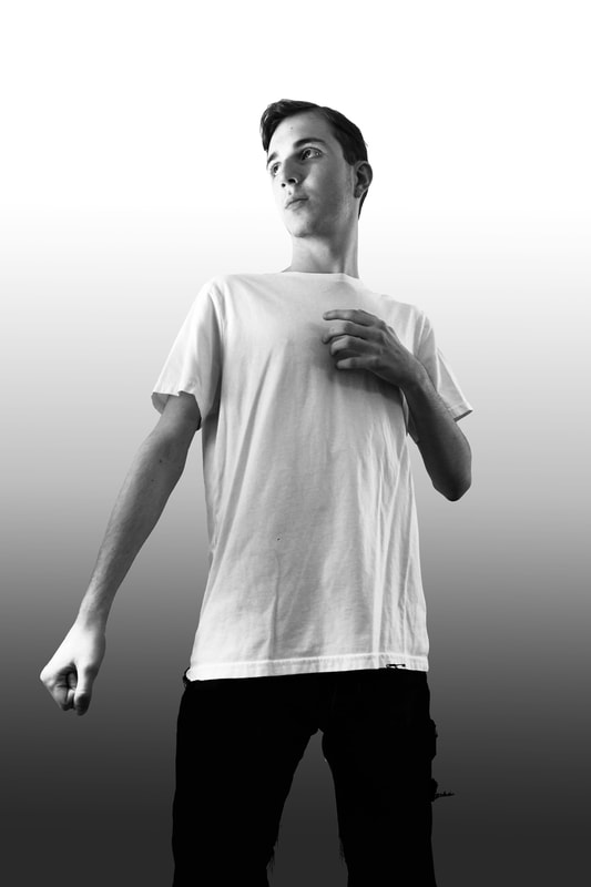

I worked out the positioning of my body, wanting a triangular positioning for the piece to have cohesive flow - something that the first draft of the piece lacked, and considered a definite improvement. Then for the city I really scrapped the original futuristic city for a design that much more closely resembled Hugh's overall works: geometric towers that used layering and depth for detail, rather than adding a messy cluster of random parts and machinery to buildings to attempt at making them feel "lived in". After I had the overall composition of the piece worked out, my mother helped me take photos of myself for the work. We took around 12 photos (6 official, the rest are repeats of the same). Out of these, I choose the 5th one in this list, mainly because the positioning worked best, along with the warm and cool lighting hitting from both sides working best. I experimented with filters on my phone to experiment with the piece's tone (as well as aesthetic), and was torn between "Mono" and "Dramatic Cool"; Dramatic Cool added a highlight to the lighting, as well as creating a softer texture, while Mono added a grey-shaded filter over the picture that added a similar effect. I went with the Mono due to wanting a simpler color-palette, while still also retaining the highlights. Next I sent the photo into Photoshop and started to work on the digital work from there.
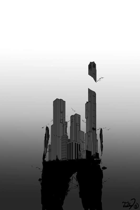
Similar to the process of the first, I used my drawing tablet and edited out the background, then smoothed out most of the edges of my figure before being happy with its look. Afterwards I worked on the background (since the left side of my body blended too much into the white background), and decided to go for a black-to-white gradient. Next, using the paint tool and my drawing tablet, I worked out the design of the individual buildings, starting around the waist. The buildings by my waist are more detailed to help contrast against the other buildings, and make them stand out more. Then from here I just drew rectangular boxes for the main buildings, added more to the framework I had, then started adding the vines, trees, windows, lines and dots for cars, etc. The largest building was the most challenging, because it's the one that went behind the arm placed above my chest. For this, what I did was just draw lines straight over the arm, then just erased what went over. Once I had the framework finished for all of the buildings, I added another layer and filled in the buildings with a solid grey. Then, as a finishing touch I added my signature in the bottom.
Similar to the process of the first, I used my drawing tablet and edited out the background, then smoothed out most of the edges of my figure before being happy with its look. Afterwards I worked on the background (since the left side of my body blended too much into the white background), and decided to go for a black-to-white gradient. Next, using the paint tool and my drawing tablet, I worked out the design of the individual buildings, starting around the waist. The buildings by my waist are more detailed to help contrast against the other buildings, and make them stand out more. Then from here I just drew rectangular boxes for the main buildings, added more to the framework I had, then started adding the vines, trees, windows, lines and dots for cars, etc. The largest building was the most challenging, because it's the one that went behind the arm placed above my chest. For this, what I did was just draw lines straight over the arm, then just erased what went over. Once I had the framework finished for all of the buildings, I added another layer and filled in the buildings with a solid grey. Then, as a finishing touch I added my signature in the bottom.
Experimentation
This piece's experimentation was the piece in of itself, because I hadn't been able to practice much after my MIAD course with digital painting - let alone with any lens-based media involved. This piece was experimentation to see how much I'd learned, and how quickly I could under with the two weeks given to complete the work. The digital painting did go very well, especially with the aid from my Wacom tablet that made this process easier, which allowed me to do the smooth-textured, surrealist painting style that I was aiming for; however, the challenge came in own self / time-management, and knowing when to move on to something else. The railing that I completed [from above] took me around 5 hours, which was not the most efficient use of my time, and was one of the large reasons as to why I moved on to the simpler style that I have in the final product currently.
Reworking the idea though led to a whole new art style that was experimental. It hearkened back towards my line-drawing pencil sketches, while still experimenting with including elements of Ferriss's architecture into my designs and making the buildings distinct yet blend with my own body cleanly. This process was arguable much less time-consuming than the original, and allowed for me to finish the work faster. Reworking the idea also gave me the opportunity to make the photograph of myself more prominent, as in the first draft I was significantly smaller in comparison to the city. I worked on making sure I was prominent enough in the piece, while still considering the size I needed the city to be. The benefited the final product, allowing better cohesion and shared prominence in the work.
Reworking the idea though led to a whole new art style that was experimental. It hearkened back towards my line-drawing pencil sketches, while still experimenting with including elements of Ferriss's architecture into my designs and making the buildings distinct yet blend with my own body cleanly. This process was arguable much less time-consuming than the original, and allowed for me to finish the work faster. Reworking the idea also gave me the opportunity to make the photograph of myself more prominent, as in the first draft I was significantly smaller in comparison to the city. I worked on making sure I was prominent enough in the piece, while still considering the size I needed the city to be. The benefited the final product, allowing better cohesion and shared prominence in the work.
Critique
When comparing my original intention to the final product, there is an obvious distinction that the idea completely changed. One criticism in comparison to my original plan was that the art style of the building isn't actually painted, and appears more sketchy; while this doesn't hinder the skyline - or the piece overall, it's an idea that I didn't get into the work, and something down the line I'd like to do. Some ideas that stayed was keeping the work in monochrome, as well as having the city be something that I have a correlation with. I think that in execution the final product was visually more appealing in its composition and color-palette than the prior idea, which would've looked more cluttered and confusing if I produced that idea instead. The work's message felt stronger and clearer because of this, being about how the city (both my city Milwaukee and the futuristic city I created) is a part of me that I use as motivation towards my goals - hence the empowered and almost heroic posture I gave myself. Despite the complete rework of this piece, it's ideas and composition turned out for the better.
Reflection
In reflection on the piece, the idea of the piece is solid and its execution - while rough - led to a product that I'm proud of. However, I think that there can be a lot of improvements and additions made to help strengthen the work's idea. Firstly, the choice I made to rework the art-style for the sake of time-constraints may have made the buildings appearance too "raw", or rather incomplete. It also doesn't match the Surrealist painting style and smooth sketching style of my inspirations John Wilde and Hugh Ferriss, where they use soft-blending techniques to adds realism and points of interest to their work. My piece currently lacks this. I hope to make improvements, going both to the blended paint style I originally intended the work to have. To build upon the rework of the art style, I'd like to add more color to the piece to give it areas of highlight and contrast, such as a variety of grays and desaturated blues to distinguish the buildings, hues of red and orange for lighting and areas of interest, hues of yellow / gold for the flying vehicles (which I'd like to give more detail to as well), and hues of green (dark olive green is the one I'm interested on using) for the greenery.
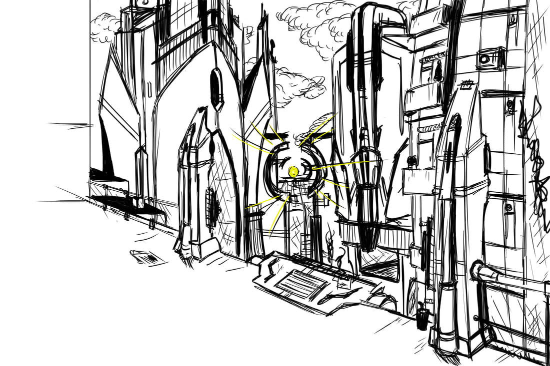
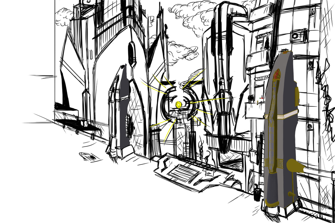
Another change I'd like to implement would be improving the tallest tower in the work, because it doesn't have the significance i intended for it to have. The tower I had in mind would use reference / inspiration from Ferriss's "Convocation Tower - 1924", along with some added bulk to the sides of the building to make the building believable in its height. The building would also be housing a gateway on its roof (or on its side - I'm currently unsure) for the symbolic purpose of displaying my soul and the connection and love I have to "the city" - the hand on my chest would be above it to show how I embrace it, but also protect it from outside forces. It would be a great addition to the piece to further reflect the integration of the city to myself, and my reactions to it.
While the piece lacks detail that I think would complete the work, what I've produced of it so far is a great foundation in making sure the composition and message of the work is solid, and be a setup in making a "good" piece become a "great" piece.
ACt RESPONSES
- Clearly explain how you are able to identify the cause-effect relationships between your inspiration and its affect upon your artwork: I was able to identify the cause-effect relationship of my piece to my inspirations through the architectural style of Hugh Ferriss and the concepts of blending the imaginary and real worlds together by John Wilde. Hugh Ferriss's architecture was inspirational to the geometric layering of multiple buildings, and the idea of the real (me) and the imaginary (the futuristic city) blending together as one.
- What is the overall approach the author has regarding the topic of your inspiration: Regarding my topic of inspiration, I used John Wilde's "Wisconsin Wildeworld" as a foundation and inspiration of my idea: the importance of understanding the integration of the real and fantasy worlds, and how the allow us to move forward. With Hugh Ferriss's work, I chose it primarily for fitting the futuristic aesthetic I wanted the buildings to convey. That was the overall approach for his work.
- What kind of generalizations and conclusions have you discovered about people, ideas, cultures, etc. while you researched your inspiration: What I discovered through my research on John Wilde and Hugh Ferriss is the value that the imagination can have in "moving things forward". What I mean is that John Wilde created works that expressed his creativity in order to re-interpret the world around him and understand it; Hugh Ferriss used his creativity to make buildings that literally moved architecture forward into the modern era it's in today. I utilized this idea in my digital collage by showing how the city - the culture, the people, architecture, art, the environment in of itself - is what gives me strength (hence the clenched fist) to move forward and create.
- What was the central idea of theme around your inspirational research: There were two themes (in reflection) that I was aiming to achieve in this work: "identity" and "moving forward". As I mentioned earlier in my Planning, I took a lot of ideas from my Tryptic, which used similar ideas of how the city of Milwaukee is what moves me forward in life, and urges me to achieve my goals of giving back to the city through my work. This piece uses this idea again, displaying how the city is my legs, and that they propel me forward. However, the city is metaphorical for my identity, in that the city is made up of the parts in my life that I choose to incorporate and integrate into MY city; the city integration into my body conveys that it is what makes up my identity.
- What kind of inferences did you make while reading your research: Inferences that I made during my research towards John Wilde's and Hugh Ferriss's two works was that both have soft texturing and blending. With Ferriss's pieces he used the layering and indentation of geometric shapes to create the detail needed to make his buildings have good contrast, depth, and overall presentation; a majority of his buildings were also massive in scale, which aided in the look of a futuristic city.
Citations (MLA)
“JOHN WILDE.” Barse Miller (1904-1973) - California Watercolorist, www.sullivangoss.com/John_Wilde/.
Lee. “Beyond Architectural Illustration.” Inspiration - Hugh Ferriss, 1 Jan. 1970, beyondarchitecturalillustration.blogspot.com/2013/06/inspiration-hugh-ferriss.html.
“Wisconsin Wildeworld (Provincia, Naturlica, Classicum) | Milwaukee Art Museum.” Crying Girl | Milwaukee Art Museum, collection.mam.org/details.php?id=8289.
