MIAD Negative Illustration
|
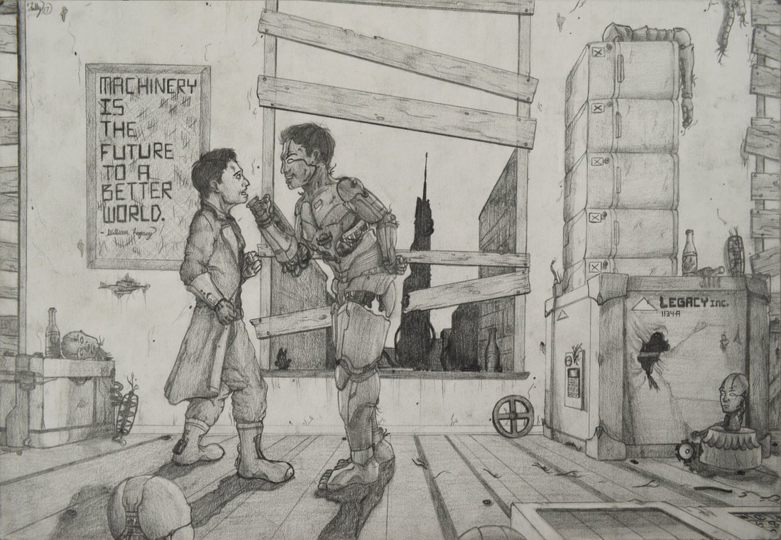
The Rogue Machine - Michael Legacy
Medium: Mechanical Pencil on Illustration Board Size: 37.9cm X 25.2cm Completed: November 29, 2017 Inspired by Norman Rockwell’s “Brother Conflict”, “The Rogue Machine: Michael Legacy” is a narrative driven, pencil drawn piece portraying the direct conflict between “Man VS. Machine”, showing the pursuit of power through technology and its consequence on the individual. The beer bottles throughout the background highlight technologies addictiveness; technologies influence on people continues through the robot aggressively lifting the man’s head, asserting dominance and control over him. |
ARTistic INspiration
 Norman Rockwell's "Brother Conflict"
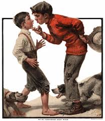
Norman Rockwell's 1921 "Bully Before"
Norman Rockwell's illustration "Bully Before" is a two part piece, with the part I choose being the first half of two. In this, it displays a scenario where one brother is scolding the younger brother, with an emphasis of tension in the piece built by the boys expressions and the two dogs on opposing sides fiercely barking at each-other. The most important thing about this work was his positioning of the two brother's. The younger brother is leaned back with his arms splayed out and is expressing fear or shock, while the other brother is leaned over the younger brother, stepping on his feet, raising his head up, and expressing frustration and anger to convey his dominance and control over his sibling. This was very crucial to what I wanted to convey within the artwork.
The idea of dominance suggests that there is room for influence or manipulation, which were concepts that I wanted to play around with my own artwork. Replicating the positions were very important to making the tension felt within Rockwell's illustration translate over to mine.
The amount of detailing he created through the emphasized use of line, space, light, color, and especially movement was something that made this artwork stand out from other works that I was choosing, which I knew were not strong enough to create the tension, momentum, and meaning that I myself was trying to convey. The vague farm-like setting established in the piece allowed me to play around with the scene's setting more, which is where a majority of the detail was planned to go into.
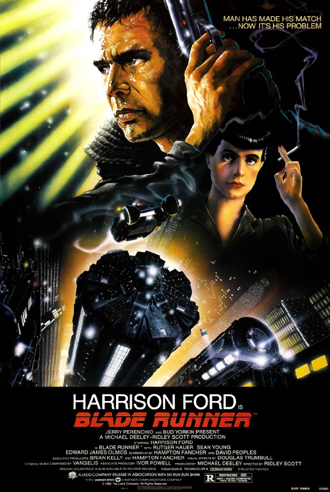
Blade Runner (1921)
When going through my planning process for both my positive and negative piece, one other inspiration from the sci-fi genre that takes the concept of Man V. Machine was Blade Runner, which I decided to use as well after I did a personal film-study on the original film; this led me to bringing those aspects of that universe into my own.
The thematic similarities that I drew from the world of Blade Runner was something that I hearkened to when working on this an obvious giveaway to this is through the presentation of Ryan Legacy, with his attire listing of a trench coat, layered clothing (the scarf), and the tall boots. In the case of how this affected the atmosphere in the work, I took a dystopian feel for this piece, but took it a step further and showed how humanity has died out from the takeover of robots in the work. The heads (that I later included in the work) were inspired from a scene in the original Blade Runner with the engineer and all of the robotic servants he built for himself.
Planning
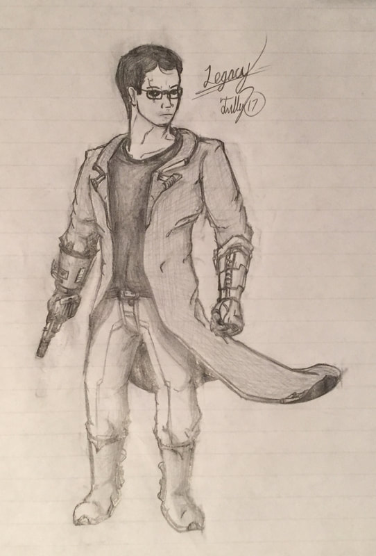 Practice Sketch of Ryan Legacy
Because the two characters in the illustration are twin brothers, I felt it necessary to distinguish them through their characteristics and attire. With the work's core conflict being an examination on human identity and ideologies during the rise of robotics and genetic engineering, I saw the opportunity to present it through the characters looks.
The first character I designed was Ryan Legacy, the lead protagonist in the work.
Ryan Legacy (who was also the main protagonist in the Positive Illustration) had a mixture of elements from the original Blade Runner film, with him wearing the Blade Runner's iconic trench-coat and boot wardrobe; he's also a detective in the story, an accidental relation to Rick Deckard's (Harrison Ford's) role in the original film. In the positive piece I showed off Ryan's robotic half, with his left arm being a cybernetic limb after an unknown accident, which in the sketch you get a better view at here, along with the detailing of the trench-coat, boots, gauntlet, etc. In the actual work I changed his expressionless face to a more scared face for the scene, and changed the detailing of his clothing to draw slightly more attention to Michael, but to also to ground Ryan's character more than the super-hero impression I got in the practice.
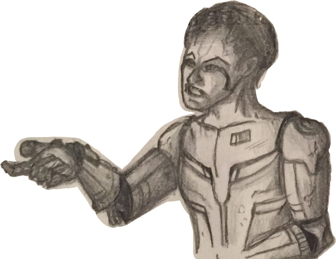 Practice Sketch of Michael Legacy
Michael Legacy, I wanted to demonstrate the manipulation and control that technology has when it goes rogue - hence why the work is titled "The Rogue Machine". The positioning in the normal piece allowed me to show Michael's dominance and use of manipulation upon the younger brother, and is metaphorically meant to show the control that machinery has on people. His dominance and manipulation in the practice sketch had me sold instantly; and it clearly demonstrated both the message I wanted to convey about machinery as well as Michael Legacy's characteristics, personality, and viewpoints.
The butterfly was at first something that I wasn't going to include at all in either works - with a friend of mine rudely drawing one on my practice sketch for the positive work, but I then decided to implement it and give it a purpose. The reason why the Legacy family's last name is "Legacy" is because the story I'm truly telling is about choosing your path, which I felt related to butterflies through "The Butterfly Effect", and the branching paths that these characters have chosen; Ryan, on the other hand, is still figuring this out for himself, hence why he's in both. Here it emphasizes Michael Legacy's turn to the "darker path", and that he is mostly gone, with the butterfly being almost completely blackened.
The butterfly was at first something that I wasn't going to include at all in either works - with a friend of mine rudely drawing one on my practice sketch for the positive work, but I then decided to implement it and give it a purpose. The reason why the Legacy family's last name is "Legacy" is because the story I'm truly telling is about choosing your path, which I felt related to butterflies through "The Butterfly Effect", and the branching paths that these characters have chosen; Ryan, on the other hand, is still figuring this out for himself, hence why he's in both. Here it emphasizes Michael Legacy's turn to the "darker path", and that he is mostly gone, with the butterfly being almost completely blackened.
Process, Ideas, & Intentions
|
|
First, when establishing the setting of the room they'd be in, I wanted it to feel uncomfortable and uneasy, and I did so by deciding to stray away from the colored work, and try the black to white spectrum that I'm comfortable using. This worked in my favor. Already, I noticed that I was able to keep in the detail that I feared I lost in the positive piece, and went a little above and beyond by adding the shadowing, which was something that I loved and added more of throughout the work as I went. Adding the buildings in the background with the wires snaking up the buildings, but leaving them black, allowed for interpretation of what they were, which to me created the uncertainty that I wanted.
|
All of the broken parts, boxes, and heads were included to fill in the space, but also show the passing of time; the poster on the left shows multiple tally marks to emphasize that. The robotic heads were added to create this sense of uneasiness, and imply that they're watching you (in the case of the scene Ryan Legacy), which created more of the intensity that I wanted. (Fun fact: the head on the bottom left has a mini-shot of the two main characters on purpose.)
Going back to the poster, while I gave it the purpose of showing the passing of time - and to show the unwinding of Michael Legacy as he went insane, it was used to show the irony of how machines have harmed the world - through this piece's perspective - rather than lead it "to a better world".
The butterfly was added in early on to convey the reasoning I stated in my planning phase above.
The beer bottles throughout was something I included later into the work to show Michael's carelessness for taking care of himself - the beer bottle caps on the floor add to this - but also to show the addictive properties machinery/technology have on us, and how it is harming us. This little detail was key to include in the piece, which is why later I added one on the windowsill to show it's equal importance like the butterfly.
When creating the brother on the right, Michael Legacy, I used what I had made in my free-hand sketch, and built heavily upon it. I went in and added as much detail as I could into his character, done through the shadowing, layering, and depth that I included - this was added by showing through him to see his robotic innards. His smug, crazy smile was something that I also deeply wanted to be emphasized, as it shows his characteristics, and shows that he isn't caring for his brother's perspective of him: he likes being a crazy, rogue-like machine.
Afterwards, I redrew Ryan Legacy, first by starting with the neck and head, then the figure-drawing of the body. Once the body was proportional and accurate to the original, I then started and quickly finished adding in the trench coat, boots, pants, and belt. Then I worked on his face. In the piece, I wanted to show a comparison from the positive piece with Ryan's human side when interacting with the robotic world. His robotic arm can still be seen, however, and is the hand poking out by his chest. On a small note, to keep consistency with the prior image, he does have the injuries on his face from the positive image, as well as his hair and nose. Ryan Legacy's facial expression were the most important part of the work because of how it added the tension I was establishing, but also showed his viewpoints on his brother's transformation and his fears; I captured that in the finalized image perfectly.
Then I finalized the detailing, shadowing, and line work, and called the piece a wrap.
Experimentation
For this piece, the large part of the experimentation was working with the piece being all shades of grey, black, and white; in comparison to the positive piece which had color in it. As I stated beforehand, this was a great choice to make for the negative piece. The work has the dark, atmospheric, threatening tone that I was trying to make, and I think it really came through; as well I didn't lose any of the detail unlike the positive piece where I did, do a lack of skill using color.
The real challenge in this work though was balancing out the different gradient's of gray and trying to keep as much detail as I could. There are some spaces in the piece where objects were either brightened to add emphasis to or darkened to draw them away from your attention. It was challenging, but fun, to balance this in a piece where it's all shadowing of grays, but I think it turned out amazing in the end.
The real challenge in this work though was balancing out the different gradient's of gray and trying to keep as much detail as I could. There are some spaces in the piece where objects were either brightened to add emphasis to or darkened to draw them away from your attention. It was challenging, but fun, to balance this in a piece where it's all shadowing of grays, but I think it turned out amazing in the end.
Critique
When working on my MIAD Negative Illustration, I was able to include objects and the characters to demonstrate all of the metaphors/symbolism's and themes that I wanted the viewer to see - the final work strongly showing all of these. My inspiration is also demonstrated through the positioning of the characters from Rockwell's "Bully Before".
Reflection
Reflecting upon the work, I am extremely happy with the results of the Negative Illustration. The message and story of the piece worked cohesively with each-other, and is one of my more prouder works that I've made; it is definitely better than my Positive Illustration, which I feel lost its meaning through coloring it and stubbornness of not making better choices for it. I'd argue that I took out the negatives made in the positive piece, and put the positives in the negative piece. Drawing my reflection back to the Negative work independently, my inspiration was directly reflected into the work through the positioning of the characters, and works very well within the piece. Although their are small hiccups with the positioning (such as the foot not on the younger one's foot, and the hand not touching the chin), I deemed it not as necessary, and thought that it gave more to the personalities of the characters: Ryan being hesitant in not wanting his brother touching him, and Michael not needing such extremes to be in control.
ACT Responses
- Clearly explain how you are able to identify the cause-effect relationships between your inspiration and its affect upon your artwork: I was able to identify the cause-effect relationship of my piece to my inspirations through the replication of the character's positions and through the message I was conveying about the machine's control and manipulation over man.
- What is the overall approach the author has regarding the topic of your inspiration: Regarding the topic of the inspiration, Norman Rockwell's amount of detail was something that I deeply admired; the positions of the characters was also very telling for the story that Rockwell was showing between his two characters, with the older brother showing dominance over the other.
- What kind of generalizations and conclusions have you discovered about people, ideas, cultures, etc. while you researched your inspiration: What I've learned about society through inspiration is the stereotype that we have about having control over other people if we're older, and how that can translate to a situation with anybody on a universal level.
- What was the central idea of theme around your inspirational research: The central theme of my piece was "Man versus Machine" and the idea of control and manipulation. While Rockwell's work doesn't touch upon the theme of technology, it does touch upon the ideas of control and the loss of it in the piece I choose as my inspiration.
- What kind of inferences did you make while reading your research: In my inspiration, I was able to note the simplicity of the story's conflict between the two brothers, and apply that directly into the work through the characters actions and expressions, aided by the environment.
Citations (MLA)
Bully Before (Image and Info): “Bully Before, the 6/4/21 Norman Rockwell Country Gentleman cover.” Best-Norman-Rockwell-Art.com, www.best-norman-rockwell-art.com/norman-rockwell-country-gentleman-cover-1921-06-04-bully-before.html.
Blade Runner (Image): “Blade Runner (1982).” IMDb, IMDb.com, www.imdb.com/title/tt0083658/.
Blade Runner (Image): “Blade Runner (1982).” IMDb, IMDb.com, www.imdb.com/title/tt0083658/.
