Legacy Illustration 3
Trapped Again - "Legacy" Illustration 3
Medium: Digital Media in Adobe Photoshop
Size: 37.97 x 25.49 cm
Completed: Sept 23, 2018
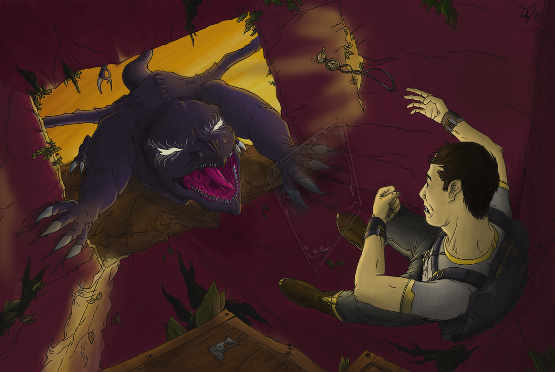
"Trapped Again" is a continuation of the Legacy Illustration series, presenting a tense scene with Ryan Legacy - our protagonist, falling back into the wall of a cargo container while shielding himself from the antagonist "The Demon". This piece focuses on anxiety - the theme translated through being trapped in a box and held back by your "demons". This work takes thematic & visual inspiration from concept artist Jon Sweeney & his works "Wild 2" & "Defend" & the from Matt Makes Games video-game "Celeste".
Medium: Digital Media in Adobe Photoshop
Size: 37.97 x 25.49 cm
Completed: Sept 23, 2018
"Trapped Again" is a continuation of the Legacy Illustration series, presenting a tense scene with Ryan Legacy - our protagonist, falling back into the wall of a cargo container while shielding himself from the antagonist "The Demon". This piece focuses on anxiety - the theme translated through being trapped in a box and held back by your "demons". This work takes thematic & visual inspiration from concept artist Jon Sweeney & his works "Wild 2" & "Defend" & the from Matt Makes Games video-game "Celeste".
Inspiration
|
Jon Sweeney - "The Last of Us" Concept Art
Jon Sweeney is an Art Director at NaughtyDog that worked heavily on concept art for "The Last of Us" & its DLC "The Last of Us: Left Behind"; his work focused on creating settings & scenarios for the game's story. The works that I focused on were his works "Wild 2" & "Defend". Sweeney in these works captured two scenes that'd play out in the game, & had to consider how these environments would work for game-play, while also making them aesthetically pleasing. How Sweeney accomplished this was by using composition, highlight, & contrast. In "Wild 2", the placement of every object is done to help define both Ellie (the girl) & the giraffe in the work. The wall on the left blocks the light from hitting Ellie - due to her position in the foreground - and puts her in almost complete shadow. This helps highlight her by having her be in contrast to the light. Her placement in the center of this work also shows that she is the focus. The giraffe is placed near the center of the frame as well, but placed in the light to show it to be a complimentary focus to Ellie. Sweeney also aids in guiding the viewer by making the surrounding environment lighter & desaturated in color. I was inspired by this works' use of composition to create highlights through contrast - as well as its usage of color, to help make my work have better focus on it points of interest that my story is trying to tell. "Defend" is another work that I took interest in from its composition. It creates a literal frame from the building around Ellie that's brighter than the rest of the image, & shows the focus the other surrounding people are targeting: her. While more of the same from "Wild 2", Defend helped me establish how I wanted to frame my work during the planning phase. |
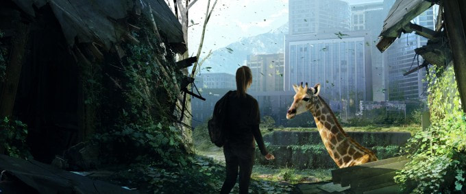
Wild 2 - Jon Sweeney - 2013
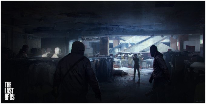
Defend - Jon Sweeney - 2014
|
|
Matt Makes Games - "Celeste"
Celeste is a video-game published by indie-team Matt Makes Games on January 25th, 2018. Celeste's thematic focus is on anxiety, and the challenges one has with overcoming it; the challenge that the studio had was how to communicate "anxiety" to the player. While in large part this was achieved through the music - scored by Lena Raine, this was also accomplished effectively through the games' overall design and art-style. The core objective of you climbing a mountain is in itself metaphorical to you climbing that "mountain" to overcome your anxiety, and through the game's 8 chapters shows how this concept influenced the level design. The level design translates the themes of anxiety through differing color palettes' for certain sections. Blues, greens, yellows, and grays are used for easier, relieving situations, while oranges, pinks, reds, and purples are for challenging, stress-inducing situations. |
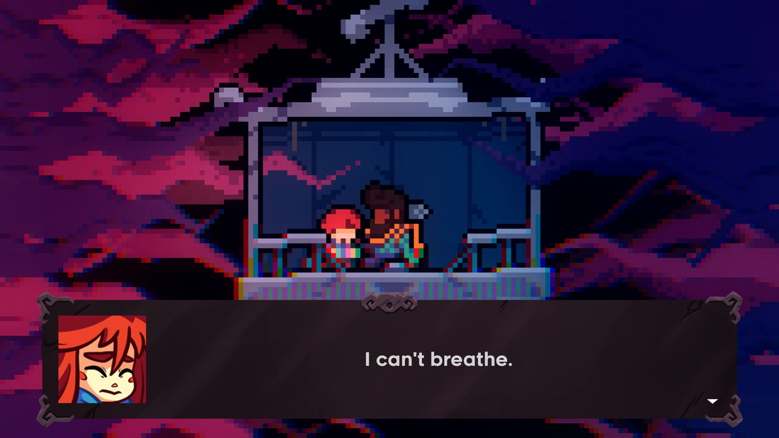
Celeste - Chapter 5 "Mirror Temple" - 2018
|
A prominent example of this is in the image on the right, where the game visually communicates the clash of these color palettes' to show a clash between safety and anxiety. The lift is in light shades of blue, signifying it as a zone of safety, comfort, and protection. The surrounding tendrils are different hues of pink and purple, signifying their connotation with anxiety; the few tendrils entering the lift shows the intrusion of anxiety on safety.
Planning
Planning Sketch 1
|
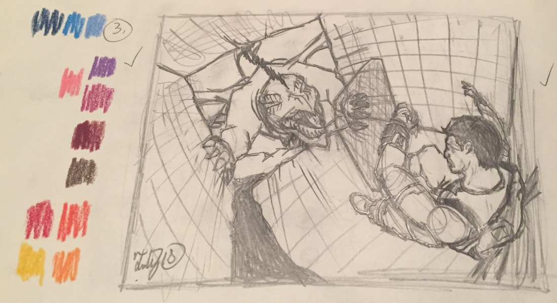
Planning Sketch 2
|
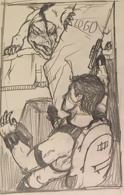
Tight Sketch
|
The intention for the third Legacy piece was to capture the feeling of being trapped by one's anxieties. Planning Sketch One was a different take on how anxiety traps someone; I wanted to have Ryan Legacy be stuck in a scenario similar to the character in Celeste, where they're in a situation where they have nowhere to go. Having The Demon be on the safe ledge while Ryan is dangling over a void visually communicates that he is stuck. Planning Sketch 2's focus was on trying to create more tension by having the character literally cornered into the back end of the cargo container. When deciding on which of the two ideas I wanted to continue forward with, I went with Planning Sketch 2 as it captured more of the anxiety-inducing emotions that I wanted the viewer to see. Using illustration paper, I recreated the planning sketch into a Tight Sketch, refining the composition and adding details like the leaking water, flora, and crates to help the work's immersion.
Process
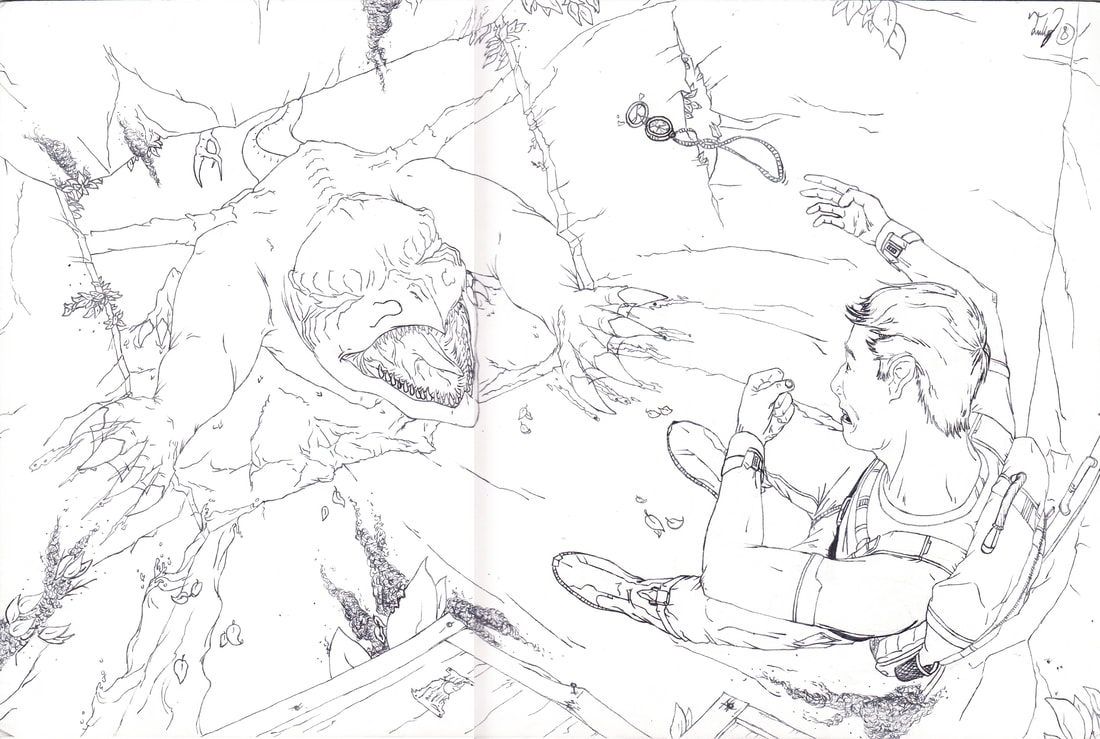
At school, I used the scanner provided in art class, and stitched together two separate scans of the Tight Sketch (I also scanned in a layer that includes the shield Ryan Legacy uses on tracing paper). Afterward I brought the image into Adobe Photoshop at home, and immediately used a feature called "Channel Mixer" that manipulates the color of the work. I selected "Black and White (Infrared)", and moved the Source Channel red to -62 to get rid of the faded shadow left from stitching the scans together. Next, using a 6 point brush tool in black, I made a new layer and retraced the lines from my Tight Sketch onto that layer. After I had the initial line-work completed, I added another layer with a white box as a new background, and made edits to areas where the lines were transparent or too thin in their weight.
Next, referencing my inspiration Celeste, I color-picked various hues of purple, red, pink, and grey, then manipulated them on the color-scale to not outright copy the colors of the original work. I started work on the creature's face - as it would be one of three main focuses, then moved towards the back of the body. During this process I added the orange background to help see how the creature would fit in the intended background color, and to decide on what the background color would actually be. Once the creature was completed, I moved onto the environment, deciding on the primary colors for the walls, then adding colors to the flora, and finalizing with blending areas of highlight and contrast, adding orange hues to edges of objects to help highlight the area of interest.
With Ryan Legacy, I made a separate layer and colored in the character's form a solid grey. Next I experimented with different base skin-tones, and then picked various tones of grey and orange for his clothing. I used the brown from the soil to speed up the process, as well as help the work's unity through cohesion of its color.
Experimentation
The biggest challenge I faced was actually the usage of color in the work. While understanding how Celeste's color palettes' contributed towards displaying the emotions and themes in Celeste, finding a way to use this in my own work required a lot of experimentation. The Demon was a creature that I had intended to be more of a blue-black mixture in my initial rendition of it in this work for continuity and to give the creature no definitive features - adding to its surreal appearance. However, I unfortunately lost my progress on the work due to my computer crashing and forgetting to save. While annoyed, I decided to redo the coloring, and spent more time working on figuring out my colors to make the later process easier. After some experimentation with purple hues that I liked, I ultimately used them for The Demon's base color. Other colors in the work I referenced from Celeste and my 2nd Planning Sketch, then adjusted them until they worked with the purple I used. Through my experimentation with different bright warm colors to contrast the purple, I found that orange would be the color that would tie everything together; being the primary color for any light-source throughout the work, including the sky. FIguring out that orange would be the main color helped in establishing the other tones, and helped the work have unity and balance through its color.
Reflection / Critique
Overall I've succeeded in achieving the overall vision I had for this piece. I used both of my inspirations - Jon Sweeney in the composition and Celeste with its color-palette - and implemented the works ideas to aid my own about anxiety. I am very satisfied with the hues in the work - however I wish that I achieved better blending and realism on the water in the bottom-left. As well, the protagonist is only flat-colored, and is in need of blending the orange highlights and grey shadow to give the work unity. I also did not get to include the shield that was in the original planning sketch - a feature that I'd like to add later on to help the works' movement and aid in visually communicating the divide between the two characters.
ACT Responses
- Clearly explain how you are able to identify the cause-effect relationships between your inspiration and its affect upon your artwork: Jon Sweeney's artwork influenced how I was going to overall structure the composition & lighting of my work. Celeste influenced the piece's color-scheme to show anxiety.
- What is the overall approach the author has regarding the topic of your inspiration: Jon Sweeney creates work that talks about humanity and people's acceptance to our flaws - through acts of violence and moments of freedom. Celeste uses its color-palettes, music, and game-play to create the sense of anxiety in the player.
- What kind of generalizations and conclusions have you discovered about people, ideas, cultures, etc. while you researched your inspiration: Conclusions I made from these works was how to better structure my pieces going forward while creating a narrative. Jon Sweeney's creates unity with his pieces by having a strong composition & utilizing contrast, scale, & color cohesively to make a piece that is easy to digest while still being loaded with texture & detail. Celeste made me understand the importance of color, and how it can help put emotion into a work.
- What was the central idea of theme around your inspirational research: The themes presented in Jon Sweeney's work is "innocence". Sweeney's work plays with the acknowledgment & lack of innocence through the 2 works I chose: "Wild 2" uses warmer colors & features a giraffe as being symbolic to innocence, while "Defend" uses colder colors & shows people willing to attack a girl. Celeste is meant to be message about how to deal with "anxiety", shown through the games darker color scheme to represent it.
- What kind of inferences did you make while reading your research: Inferences I made during the process was spending time on composition & color to enhance the piece in its storytelling. Jon Sweeney's work uses composition & color to create highlights through contrast. Celeste uses the colors in its environment to signal its viewer of "anxiety" or "feeling anxious".
CITATIONS (MLA)
Celeste - "Celeste." Nintendo Switch Version, Matt Makes Games. 2018.
Celeste Image - Celeste - Mejia, Ozzie. “Celeste Review: Queen of the Mountain.” Shacknews, Shacknews, 25 Jan. 2018, www.shacknews.com/article/102980/celeste-review-queen-of-the-mountain.
Jon Sweeney "Wild 2" & "Defend" - “John Sweeney.” ArtStation, www.artstation.com/johnsweeney.
Celeste Image - Celeste - Mejia, Ozzie. “Celeste Review: Queen of the Mountain.” Shacknews, Shacknews, 25 Jan. 2018, www.shacknews.com/article/102980/celeste-review-queen-of-the-mountain.
Jon Sweeney "Wild 2" & "Defend" - “John Sweeney.” ArtStation, www.artstation.com/johnsweeney.
