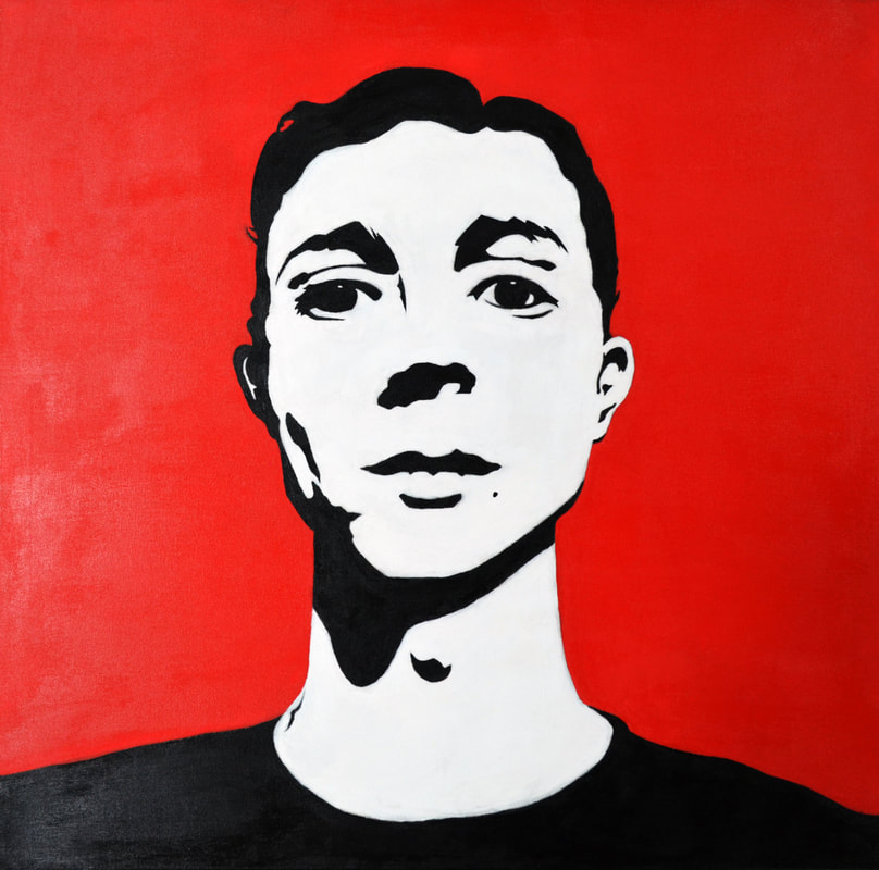
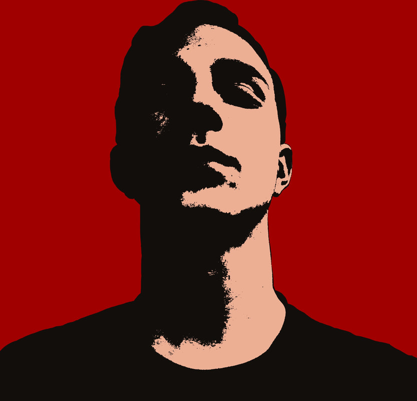
Self Portrait
|
Complexity
Medium: Acrylic Paint on Canvas Size: 91.44cm X 91.44cm Completed: December 8, 2017 Inspired by Andy Warhol’s 1964 “Self Portrait”, “Complexity” is my Self-Portrait that directly displays how I’ve bottled up personal experiences, insecurities, and anxieties. My facial expression lacks any emotion through the mouth, but instead through the eyes - looking ahead directly at the viewer. In conjunction, the background color - a deep red, was chosen to exhibit a mixed, complex emotion of anger, frustration, longing, and willpower. |
Artistic Inspiration
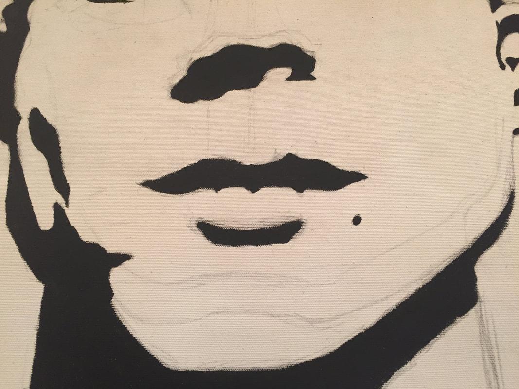
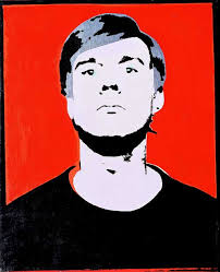 Andy Warhol's 1984 Self Portrait
Andy Warhol - Self Portrait on Cyan (1964):
On the surface level, this variant of Andy Warhol's Self Portrait was meant to capture the idea that while we recognize Andy Warhol for his artwork, he wanted to be recognized for who he was himself, hence the image here. The artist's face is stagnant in the piece, to demonstrate no clear emotion for the artist, allowing the viewer to decide what it is that Andy Warhol wants us to see of him. The piece tells us everything about what is going through his mind, while doing so by also giving is nothing about his present emotion in the piece. The positioning of his head creates the sense that he has authority, while also displaying the vulnerability of him as an individual.
His use of red, however, is where the true emotion comes through, and where the idea of its complexity (which is why the title is named such) is suggested here. Red is the most subjective color when it comes to conveying an emotion, such as love, embrace, action, anger, frustration, stress, and even more. This is something that I felt was essential to applying the ideas of my piece expressed in my exhibition text, and kept note of its importance in my planning phase.
Planning
|
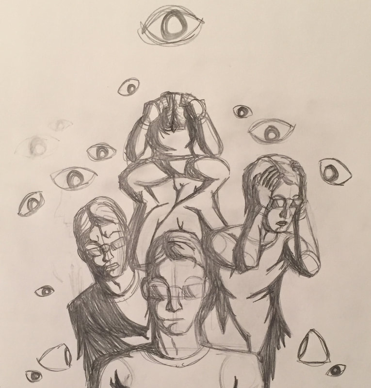
When I first was planning out initial ideas, I had seen a work of Norman Rockwell's of President Ronald Reagan, and what drew me toward it was how it had multiple expressions in various angles, but still had good movement to not disrupt the piece. Based off of that, I had drew this sketch of me on the bottom (from the Warhol inspiration), and combined it with the elements in the Rockwell work. The eyes were a last-minute touch as to explain why these emotions were occurring: the influence of those in power. After the initial planning sketch I drew, however, what I took away from it was that I was overdoing the piece by displaying too much, and decided to simplify the composition to just the bottom focal figure in the sketch, drawing my product closer to my first and primary inspiration.
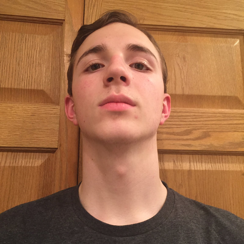
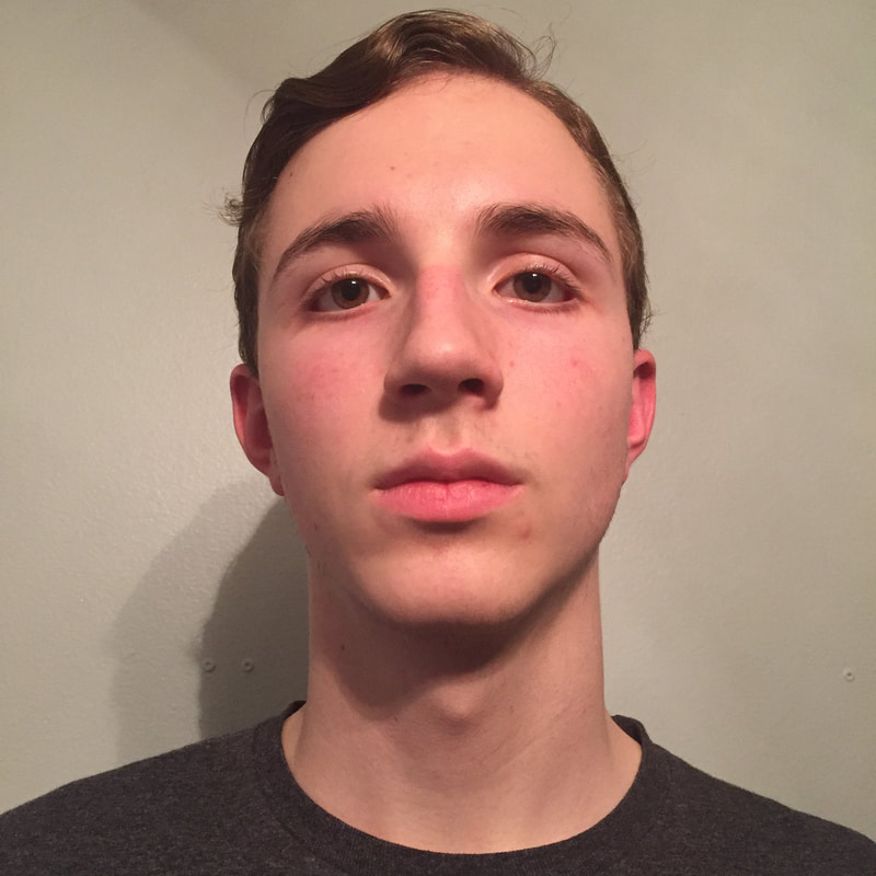
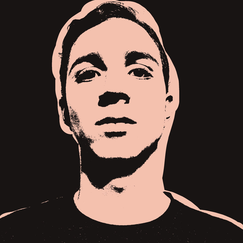
When working on ideas for the other work, I took a picture of myself from my phone and used a filter in an app titled PicsArt - then increased the image's contrast - to see how the shadows from the original translated into the style I was trying to recreate. While I was happy to see how the image had great contrast and layers of shading, the biggest thing that threw me off were the glasses, and how they blocked - to me, the most important part of any self-portrait: the eyes. The eyes are really the "soul" of a person, and the glasses didn't allow you to read the person's thoughts and emotions - which may be for other works intentions, but not for mine. I continued to experiment with finding the right image. For the second and third image, I took these images at home with the intent of finding the image I would be using. For the middle row of images, I put the extra effort with the PicsArt app by cropping out my figure and placing it in a crimson red background, which made the image pop; I did intend for the background to stay red whether I choose one of the two over the other. The third one I had rushed for time, but it still got the point across like the other competitor. Despite rushing the last one, I choose it over my second design. Why? Because of the eyes. I wanted to prioritize the eyes in the portrait - like Warhol did in his - and the third work revealed the eyes (and the emotions contained within the individual) the best. It also hearkened back closer to my inspiration. |


Process, Ideas, and Intentions
|
Making the Canvas:
First, I had to make the canvas in order to actually create the painting. Mr. Chad, my art teacher, provided the frame and the canvas material to make it. I put together the frame, then cut out a square of the canvas sheet slightly larger than the frame. I laid the canvas underneath the frame, stapled the folds of the sheet to the frame, then sat it upright in an easel and applied gesso to tighten the canvas for painting. Painting: After I had chosen my planning image and made the canvas, I went straight to replicating my image onto it; this I had done just through reference of the image on my phone's photo gallery, or later from my laptop. I also had to get creative with what "easel" I had to work on, as at home I did not have an easel. |
|
As a supplement, I used one of my kitchen chairs - but, after realizing the ends of the chair were poking through and imprinting the canvas (also seen on right), I put a piece of cardboard behind while painting to prevent any further damage from happening on the canvas. Following this, I referenced the image over onto the canvas - with some minor struggle in getting the proportions correct, and then almost immediately after finishing the outlining started work on the painting. This for me was the most relaxing part of the process, despite being the longest, for two reasons; one: my sister was playing the piano, ironically, and two: the process was much more engaging and easy to do. Despite being nervous about the painting not having the fine-line work that Warhol had (despite some overlap in the work I choose), I was able to very easily create the cleanliness and solidity that I needed for my piece to work. I broke up the body into separate parts, which made the process easier; first the shadowing, then the mouth, then the nose, next the eyes, and finally the shirt. Then I filled in the negative space inside of the figure in white (it also covered up my sketching lines/mistakes very well). Finally, I added the red background, which complimented my figure and made it stand out more; it also gave the complexity of various thoughts and emotions that I was going for, as I wanted people to interpret what I was feeling from the red color primarily, along with the subtlety of empowerment and uncertainty captured in the expression.
Experimentation
|
|
A large experimentation in my work was getting the proportions correct. While in these images it may be harder to see, what I did was draw lines and boxes across the entire face to map out the confines of each feature in the piece; the hardest one to do would be the eyes.
While the nose was a simple touch-ups to round out the nostrils, and the mouth was a small stretching, the eyes were not in their proper place. Both of the eyes were level with the ears, which isn't accurate to the planning image due to my head leaning back, which raises the eyes up higher than the ears; so I had to completely redo the eyes and move them up about two-three inches, which was what I did. |
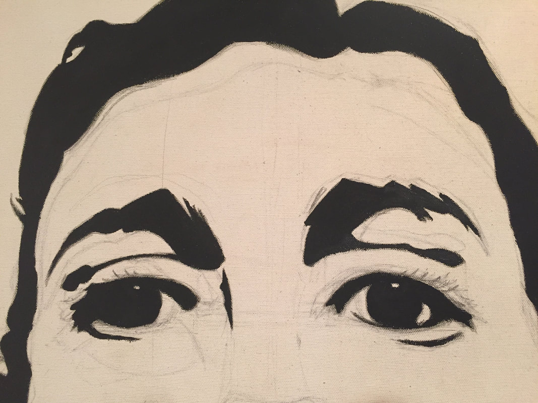
When redoing the eyes, I first framed out the eyebrows where they were meant to be - about four inches from the hairline. Afterwards, using the eyebrows and my image of reference, I boxed out where the eyes had to be to be proportionately accurate to the perspective of the image, which meant that they would be angled slightly upward in order to create that affect (this affect is aided from the viewing of the nostril rather than the entire underside of the nose). Using these reference boxes I made on the canvas, I was able to successfully recreate the eyes to the best of my ability. While this was of the biggest challenges to making the piece (I must admit the painting was easier to do), it was well worth taking the extra time to making the piece great.
Critique
I stuck very closely to the original design of Andy Warhol's portrait through the technique he used and his art-style (my particular favorite). I also got to include the red background that I thought was essential to telling the emotions to the piece, as well as adding a nice contrast in the color of the work.
Reflection
My self-portrait was equally as much fun to work on as the MIAD Illustrations (which I worked on simultaneously with this). While painting is something that I'm not as drawn to - as I struggle with blending and creating detail like I can in my sketches/drawings, this experience has made me want to further experiment with painting in the near future.
Reflecting upon how well my work held to my inspiration, I think that I did very well. I was able to imitate Warhol's art-style through his defined lines and shapes, and overall composition of the work by still embodying the meaning and emotion from Warhol's in mine through the determined, but drained facial expression portrayed in both; the emotion in this piece was key tot making it work. The red background in the image also turned out amazing, adding a nice contrast - or pop - to the black and white color of the figure; and aids in conveying the subtlety of emotion in the work.
Reflecting upon how well my work held to my inspiration, I think that I did very well. I was able to imitate Warhol's art-style through his defined lines and shapes, and overall composition of the work by still embodying the meaning and emotion from Warhol's in mine through the determined, but drained facial expression portrayed in both; the emotion in this piece was key tot making it work. The red background in the image also turned out amazing, adding a nice contrast - or pop - to the black and white color of the figure; and aids in conveying the subtlety of emotion in the work.
ACT Responses
- Clearly explain how you are able to identify the cause-effect relationships between your inspiration and its affect upon your artwork: My inspiration directly correlates to my self-portrait through the overall positioning and expression of my figure, and from the color pallet of black, white, and red.
- What is the overall approach the author has regarding the topic of your inspiration: The topic of their inspiration was to show how we hide our emotions, and only show what we want to present to people.
- What kind of generalizations and conclusions have you discovered about people, ideas, cultures, etc. while you researched your inspiration: What I've discovered from this work was that we only choose to display and tell people what we want to, and choose to hide our inner emotions; this piece uses the emotionless expression to demonstrate what we hide, while the red displays the various emotions.
- What was the central idea of theme around your inspirational research: The central idea of theme in my research would be identity, and how we create the identity that we want people to know about, while we have our own personal identity to ourselves.
- What kind of inferences did you make while reading your research: Inferences that I made during the research process was that the color in the piece displays the emotion, and I took away the technique and styles of pop-art and later applied them to my work.
Citations (MLA Format):
Self Portrait Image (1964): Early Self-Portrait, 1964. Acrylic, silver paint and silkscreen ink on canvas 50.8 x 41 cm. Froehlich Collection, Stuttgart © 2004 Andy Warhol Foundation for the Visual Arts / ARS, New York
Self Portrait Info (1964): “Andy Warhol Self-Portraits, Studio International.” Studio International - Visual Arts, Design and Architecture, www.studiointernational.com/index.php/andy-warhol-self-portraits.
Self Portrait Image & Info (1986): Tate. “'Self-Portrait', Andy Warhol, 1986.” Tate, www.tate.org.uk/art/artworks/warhol-self-portrait-t07146.
